RESPONSIVE WEB APPLICATION
Leadership training platform
B2B • Product Redesign • User Experience Design • Information Architecture • Interface Design
Results
Improved user experience design which increased course completion rates. Improving design and communication of platform user insights. Delivering a responsive design library with a Mobile-first optimisation of components and improving course dashboard & progression trackers allowing social integration and product gamification
Challenge
Potentialife is a London-based startup offering a positive psychology and leadership development platform. Founded by a Harvard professor and an ex-McKinsey director, it drives behavioural change and productivity in organizations like Sainsbury's, Barclays, and Deloitte.
The platform faced challenges with its outdated interface, hindering navigation. Users required extensive support to understand insights. Poor device performance affected work-related usage. Managing multiple platforms and a difficult content management system caused maintenance issues, while result quantification proved challenging.
Scope
UX Strategy
UX Workshops
Usability Testing
Stakeholder Management
Information Architecture
Data Visualisation
Responsive Design
UX Copywriting
Design System
Key pain points
How was Potentialife's product currently working for its customers, their users and the business itself?
Customers
• Confusing course navigation
• Lengthy page text
• Unclear data representation
• Confusing form fields
• Multiple platforms
• Difficult to use via mobile
Business
• Difficulty supporting users
• Long onboarding times
• Hard to quantify results
• Challenging CMS systems
• Users on low-quality devices
• iOS/Android/Windows Apps
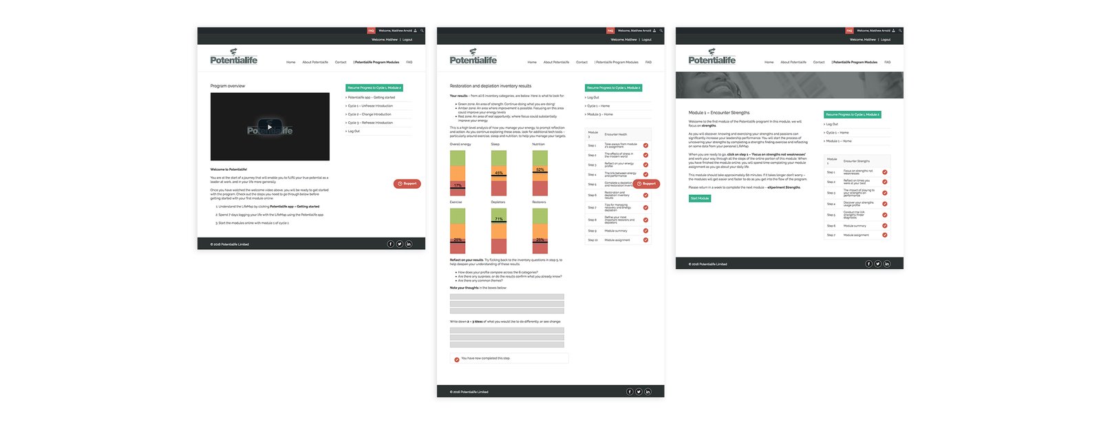
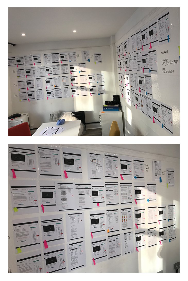
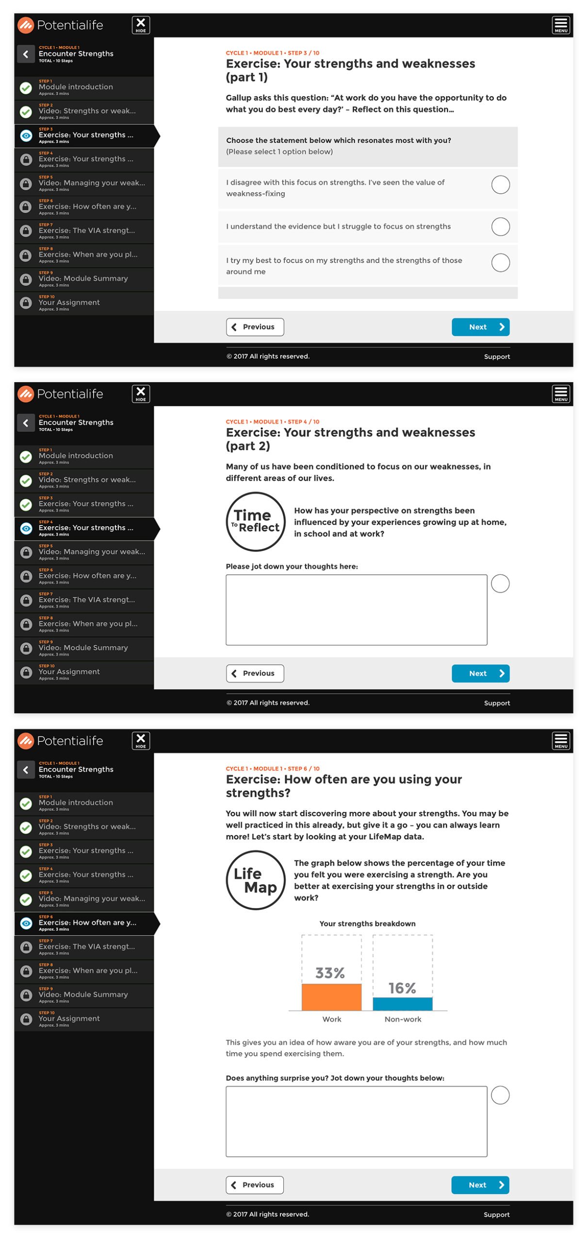
Above: Sample key problem pages from the original Potentialife education programme
Understanding fast
One of the quickest ways to get information out of a team is to run a workshop with key representatives across the business. Where we were able to get a complete brain dump from every department involved.
This enabled us to gather a much richer understanding of the business, how Potentialife aids its users, where the product comes into their lives and how it compares to other competitors within the market, plus it helped draw out attention to some of the key challenges the business faced.
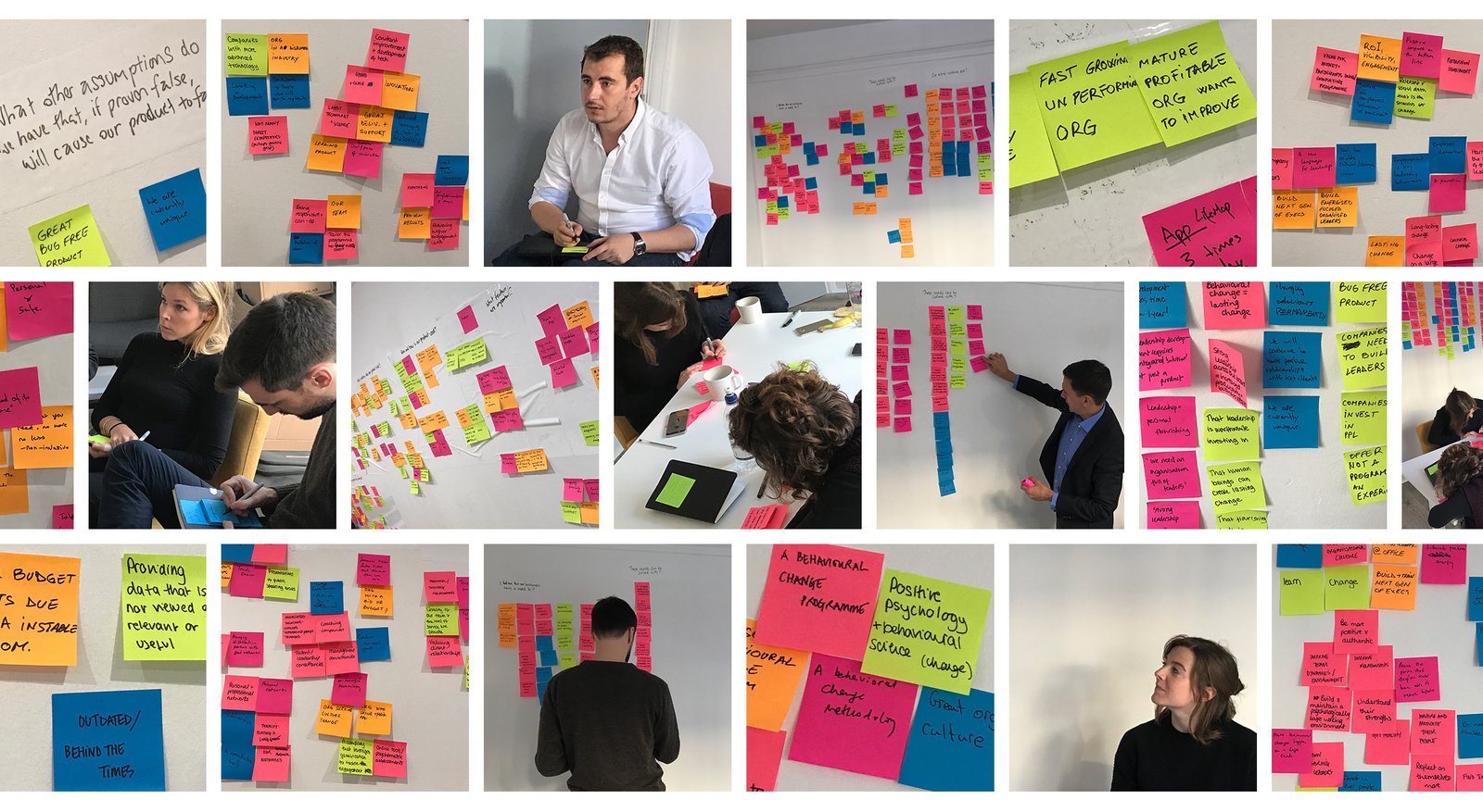
Above: Workshop ran with key stakeholders to understand the Potentialife product & it's customers
Workshop output
There were many valuable insights to come from these sessions; the aspiration for the business, challenges from competition, technical concerns, communication oversights, but my favourite is learning to understand the customers and their users.
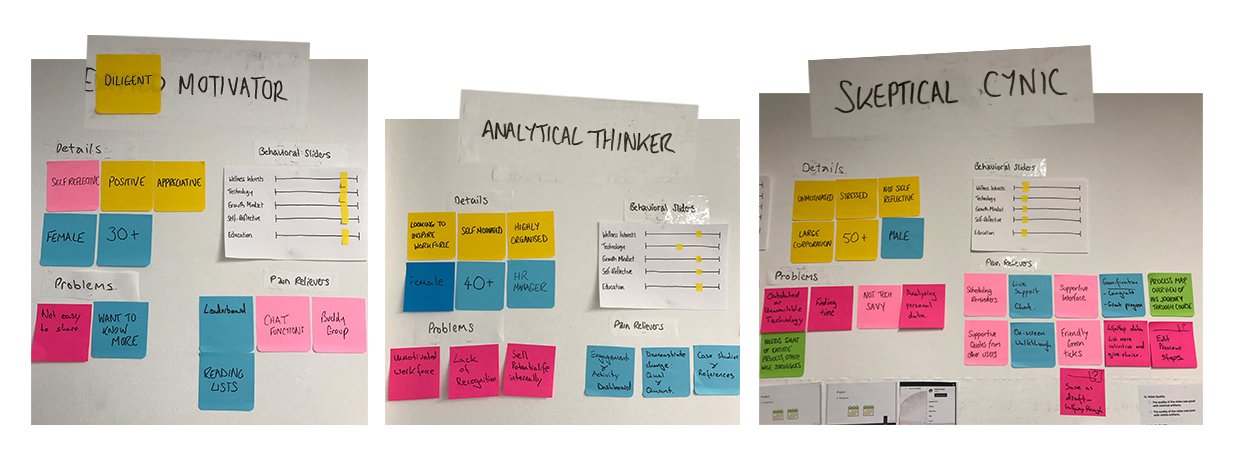
Above: Three assumptive personas we throw on the wall enabling the product team to discuss product development strategy
The course information architecture
Understanding the complete course structure was essential to address some of the key pain points support continually heard from users. Creating the graphic below enabled us to lay the foundations for improving the products information architecture and navigation.
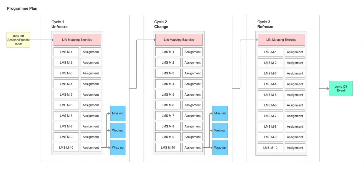
Above: High-level information architecture of kick-off, course cycles and in-person sessions
Simplification with a design system
Gathering site of the format of the current course allowed us to assess our new design systems requirements. We looked for key page templates, created a list of components and their modules. We discussed specific pain points, looked at how data was currently displayed and began wireframing potential solutions.
The benefit of a design system was that once built it would allow the team to quickly iterate, utilising the rules to build while still maintaining a user-centred approach for the product.
Above: Original course structure laid out to assess the required system design assets
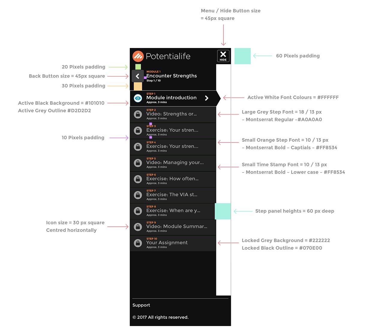
Responsive navigation
Our goal with the responsive navigation was to develop a solution that would be understandable and act as a helpful addition to the users' course experience.
We aimed to answer questions such as; Where am I? How much do I have left to complete? What needs to be completed? What have I completed? & How far till the end of this module? All questions the support team often found themselves answering.
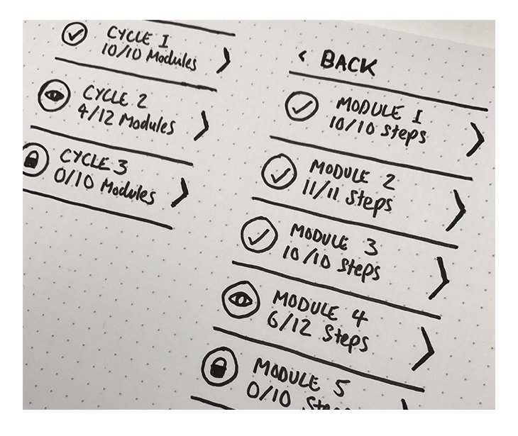
Above: Navigation wireframe
Wireframing
Using a mobile-first approach we began to wireframe key pages and components that would make up our design system and contribute to our new responsive framework.
Mobile wireframes
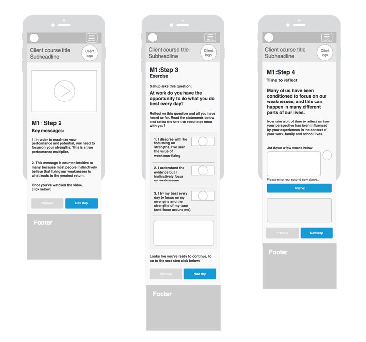
Above: Mobile wireframe of the programme video sessions, course questionnaire and comment boxes
Desktop wireframes
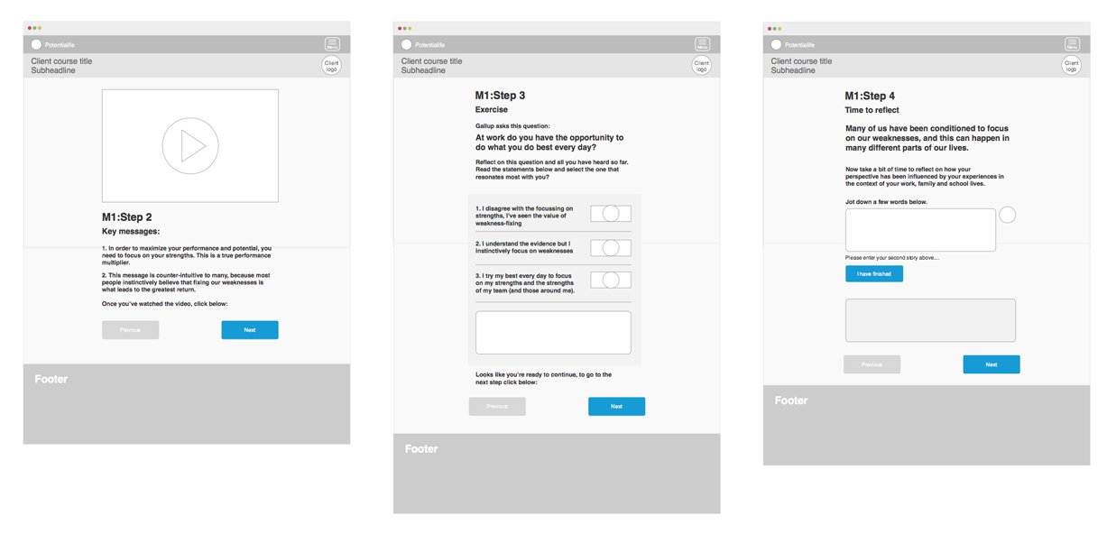
Above: Desktop wireframe of the programme video session, course questionnaire and comment boxes
Design system components
Our components needed to work seamlessly together. Slowly laying up the different elements of the experience allowed us to do this through interface styling and design.
We needed to consider, how does our typography look across the product. How does it work with the marketing and the Potentialife brand? What happens to these elements across different screen sizes? Will all our users be able to read the smallest font size? Are the form fields clear and usable? How does a questionnaire look? How do tables fit together and work responsively? is the information required within a table clear and easily understood?
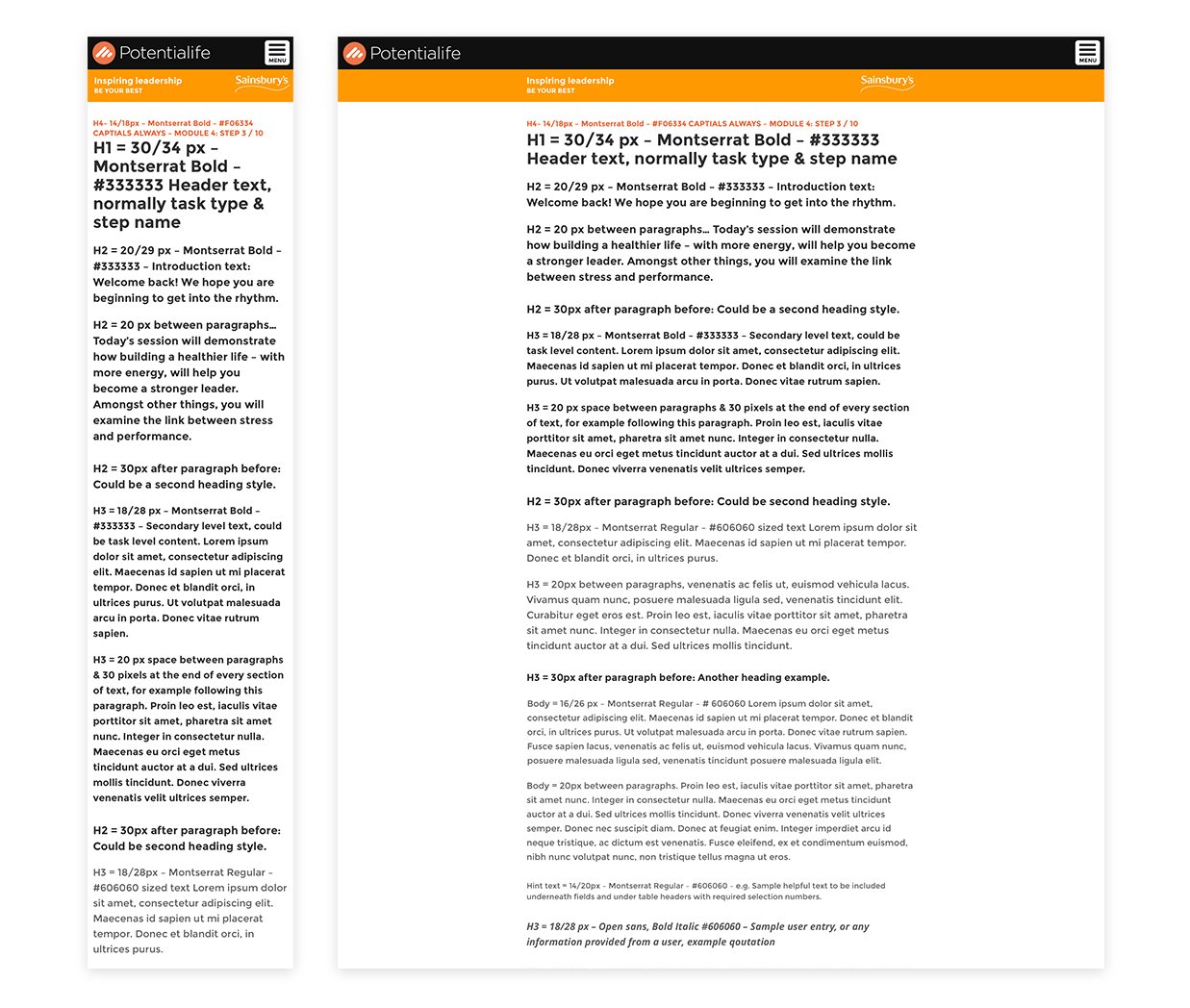
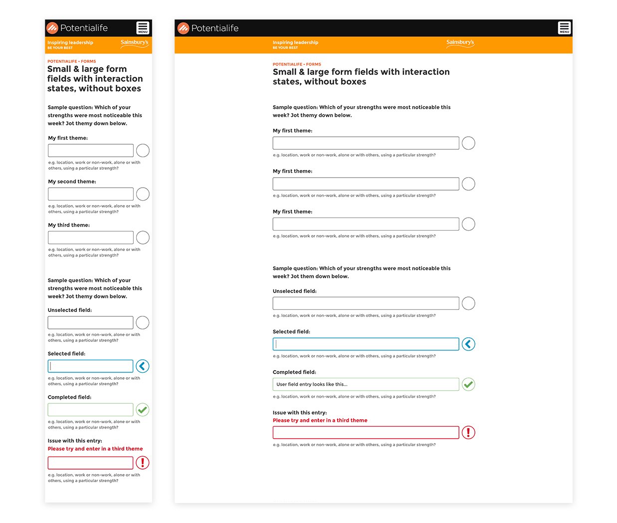
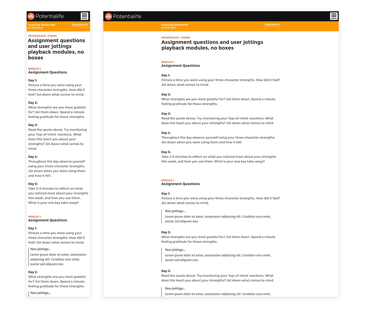
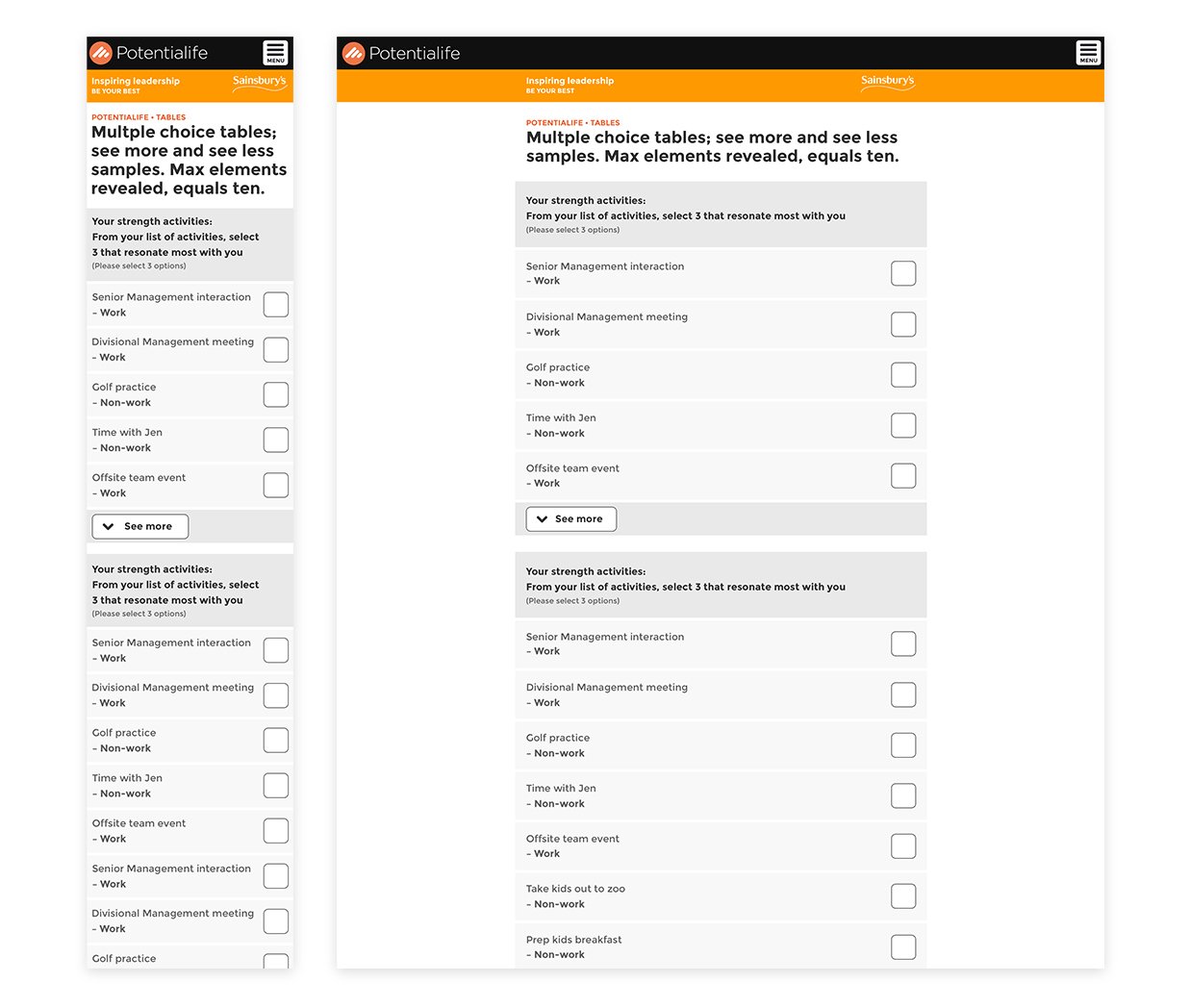
From left to right: Product typography styling, product responsive form field designs, Assignment question components, Multiple form field entry points
Interaction design
One of the key challenges for the product was the interactions user experience when answering questions and receiving insights back from the data which they had entered.
We worked hard to make sure that these interactions become effortless and obvious for what was required from users.
We asked questions like; How do we make questions 100% clear to users? Is it obvious that there are a number of answers, and how they relate to one particular question? What happens once a question has been selected? How do we show this? And Is it clear for a user which question they have selected?
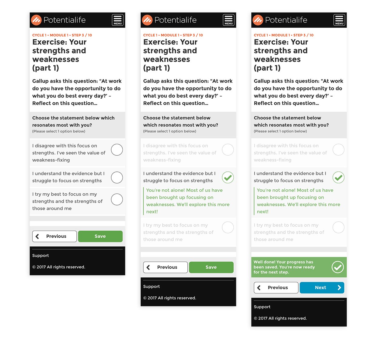
Above: Mobile form entry interaction design
Navigation interface design
The navigation needed to be clear for users, providing sight of where they are and what lies ahead for them, a challenge that the support team had referenced as something many users were currently confused with.
We asked many questions like: How do we position different required elements of the navigation? What text is more important than others? How do the icons fit into place? How do we keep everything touch-enabled? And what do these interactions look like?
Above: Responsive Interface design for course overview and progression tracker
Usability testing
How do we know if the solution makes sense? Can users find their way around? Is it clear which step is next? Does the data visualisation communicate the insights? Is it an easy and seamless journey from the dashboard to a user's next step? Is each required task clear? Does the language make sense?
These were just a few of the questions we tried to gather answers to while testing variations of the product. With each learning, new insight, we iterated and then tested our improvements.
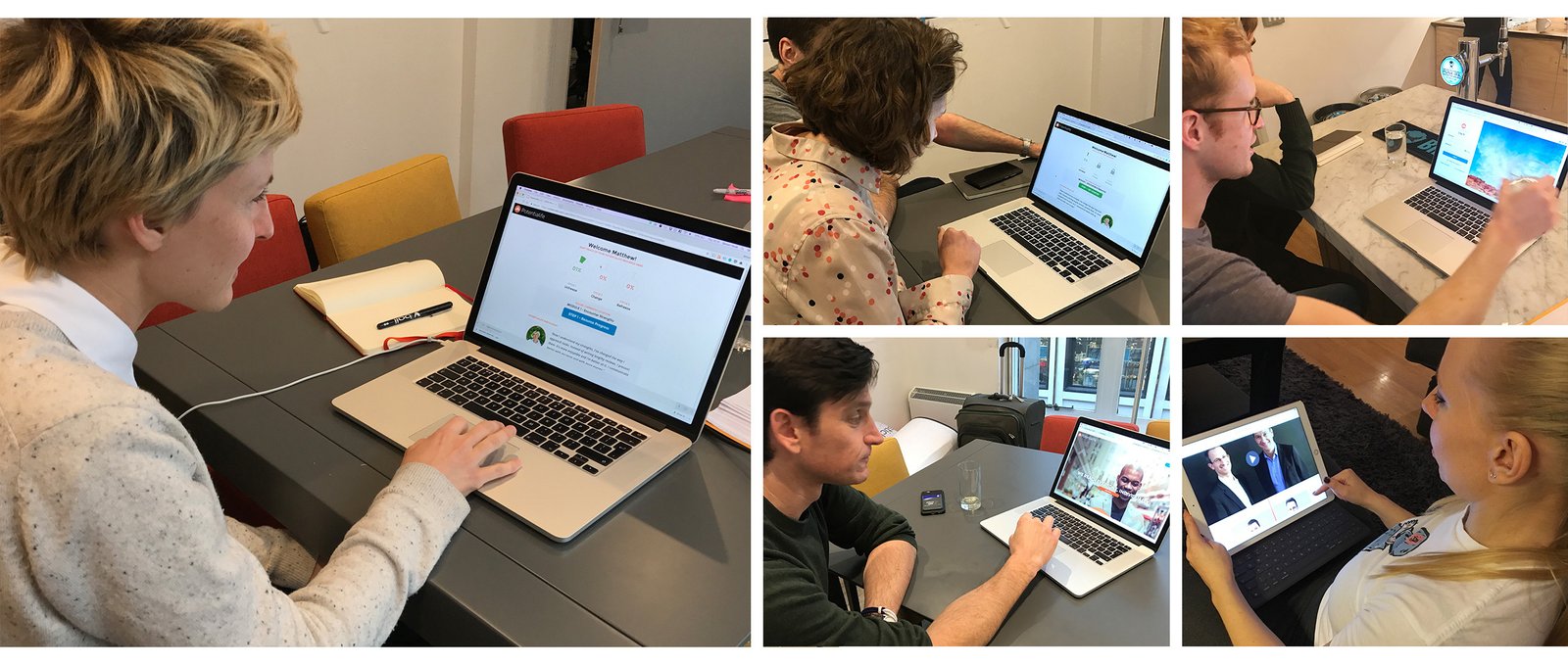
Above: User Testing Sessions
Product engagement
One of the biggest challenges for the business was keeping users engaged. We asked the question of how could we use the interface design to encourage users to keep up their engagement with their learning through the programme?
Through the use of inspiring imagery on the login screen, a dashboard to share a users progression, clearly displaying how far an individual had progressed, what that individual had achieved so far and we also throw in some encouraging words from previous users of the program, from the same company.
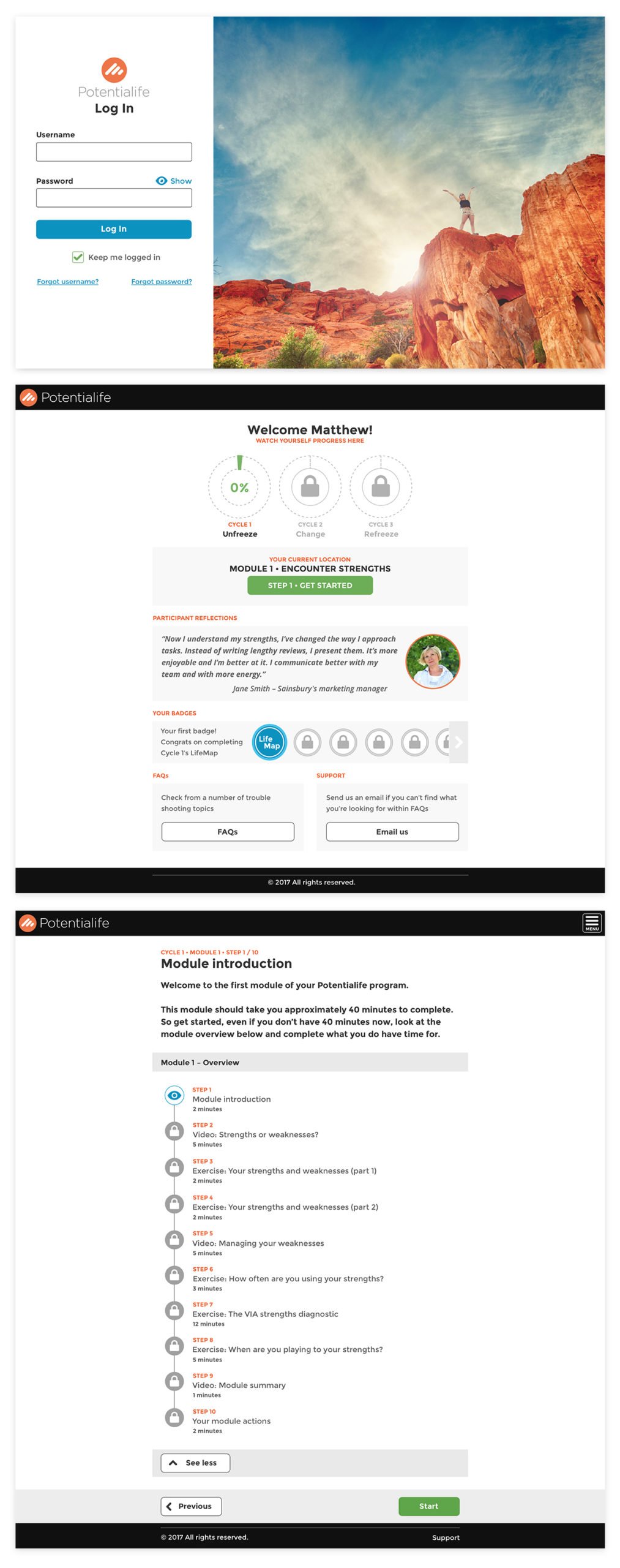
Above: Login Screen, User Dashboard, Module Overview Panel
The learning experience
With careful consideration of the product's experience, streamlining the content and putting a focus onto the learning experience itself.
We trimmed down many exercises and refined each step to make them as simple and straight forward as possible for end-users, our goal was to remove any unnecessary complication so that users of the product could quickly and easily make their way from each step to the next. Hopefully, improve the experience for a complete focused learning experience with each section of a module.
Above: Desktop questionnaire, noting exercise & insights reveal
Results
With Potentialife's focused effort on improving its user experience, the team was able to achieve many of its initial goals through this project.
Improved navigation
• Improved overall product usability
• Clearer sight for users current course location
• Preview for what's on users course horizon
• A responsive, mobile-first solution
• Touch enable interface design
• Creating more intuitive user experience
Improved interface design
• Clear hierarchical component structure
• Cleaner art direction and typographical layout
• Easy to view & use course stages and next steps
• More intuitive form designs
• Clearer user interactions & course experience
Experience dashboard
• Complete course overview
• Social integration with course participants
• Easy resume function
• Badge encouragement and gamification of product
• Easily accessible product support