WEB APPLICATION
Business relationship mapping platform
B2B • Product Redesign • User Research • User Experience Design • Information Architecture • Interface Design
Results
This product redesign delivered a 110% increase in monthly active users from 19,000-40,000, a 300% increase in tablet sessions because of its improved touch interaction design and supported with an acquisition to Euromoney Plc for $87.3m.
Challenge
BoardEx is a database of top corporate leaders worldwide, often referred to as "LinkedIn for Grown-Ups." It features profiles of the Board of Directors, Chairman, NEDs, EDs, C-Suite, Leadership Teams, and Senior Management. Renowned for its data quality, BoardEx serves as a powerful business intelligence tool. However, its lack of user experience design, interface design, and mobile optimization hindered usability for users and made it difficult for new users to understand & utilize
Scope
UX Strategy
User Research
Usability Testing
Service Design
Stakeholder Management
Information Architecture
Responsive Design
Data Visualisation
Design System
Research

Customer interview sessions held in offices around the world. From left to right: London, New York, Washington DC, Chicago, Los Angeles, San Francisco.
Global user study
BoardEx is a data product that services some of the biggest corporations in the world across multiple sectors. Everything from Banking, Legal, Professional Services, Executive Search, Asset & Wealth Management, Private Equity, Academics and Non-Profit all of which have their own unique requirements from the data that BoardEx can offer.
This made it essential for the team to gain a true understanding of its clients and their unique requirements from the product before we could confidently begin improving the product. Interviews were conducted in London, New York, Washington DC, Chicago, Los Angeles and San Francisco.

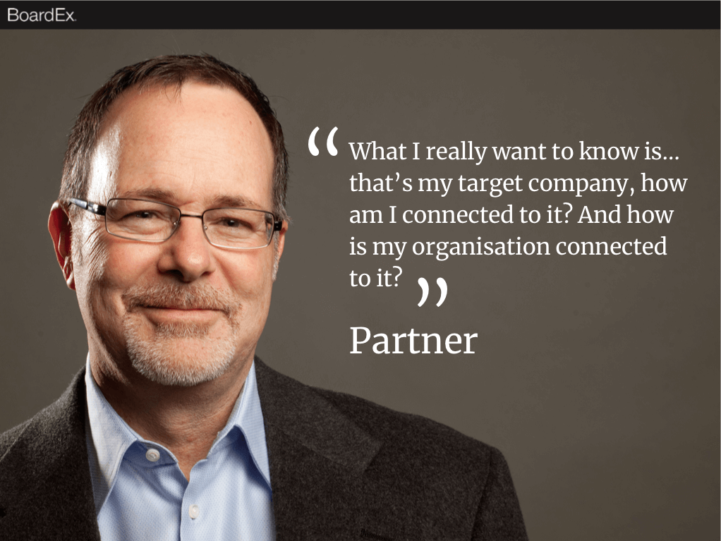
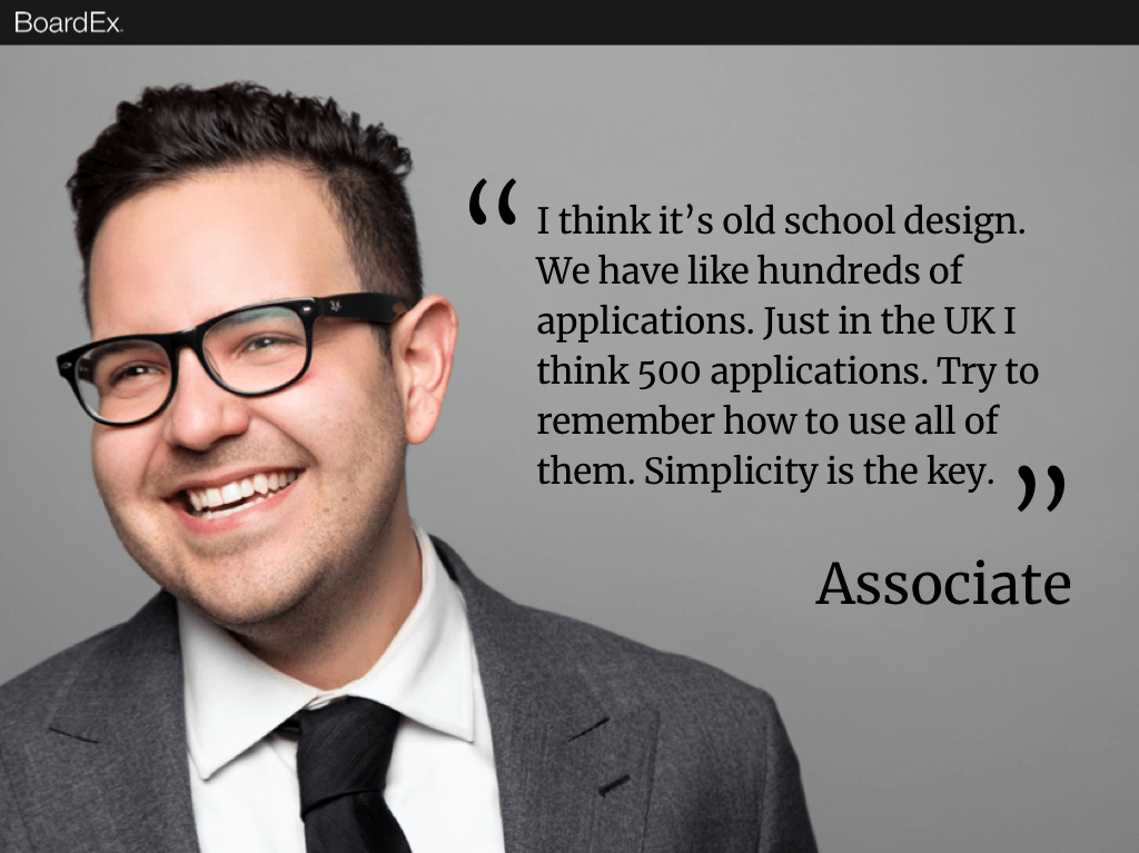
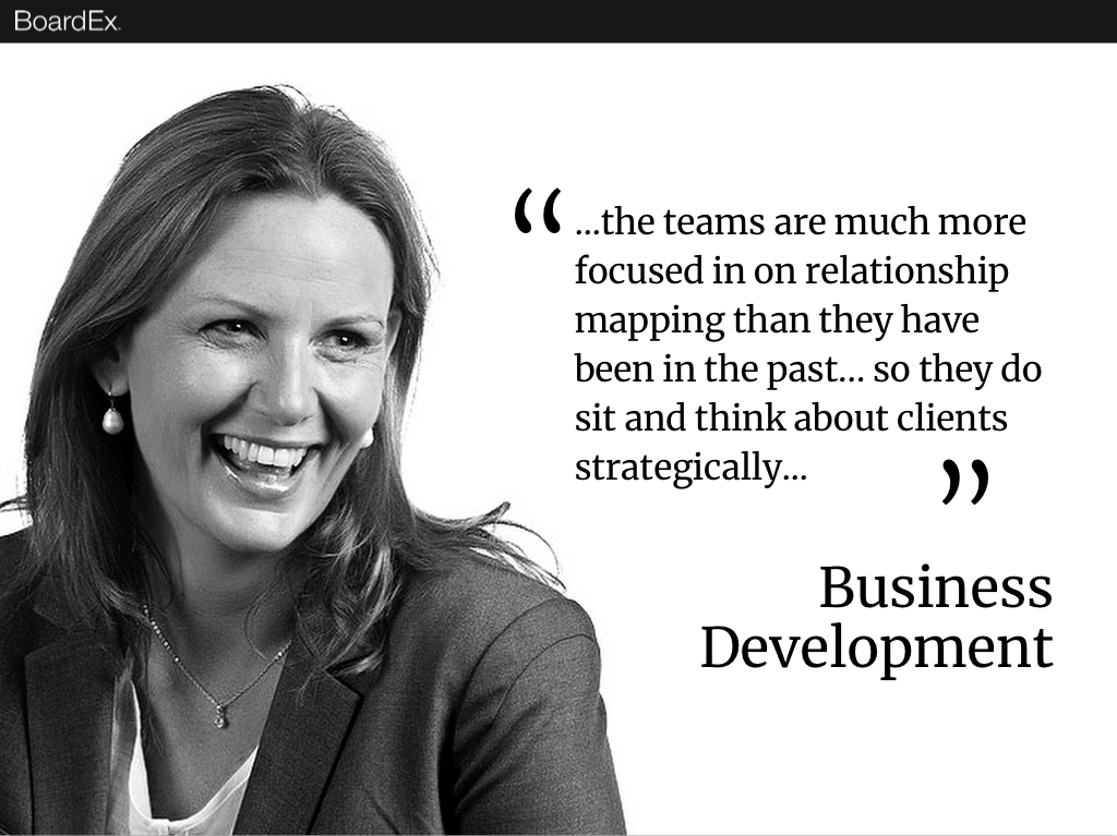
Personas
Analysis of the 50+ interviews conducted as part of our research phase defined some clear common requirements and they stretched across the internal hierarchy of organisations. With this, we defined 5 key personas each with their own unique challenges and requirements from BoardEx.
There were some clear nuances depending on the sector of product use but the majority of user needs, problems and challenges remained consistent which enabled us to deliver these key personas for business focus with user experience improvements to the product.

Structure
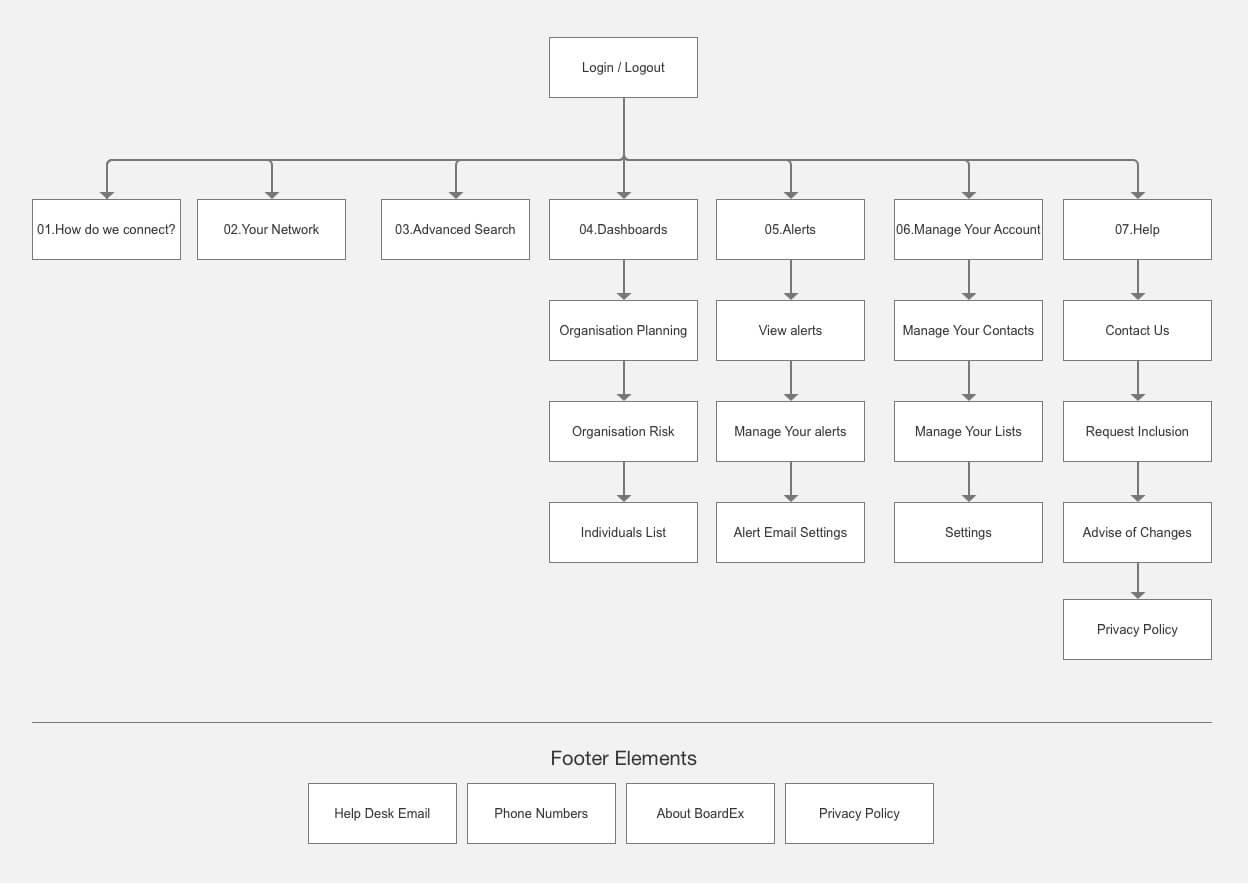
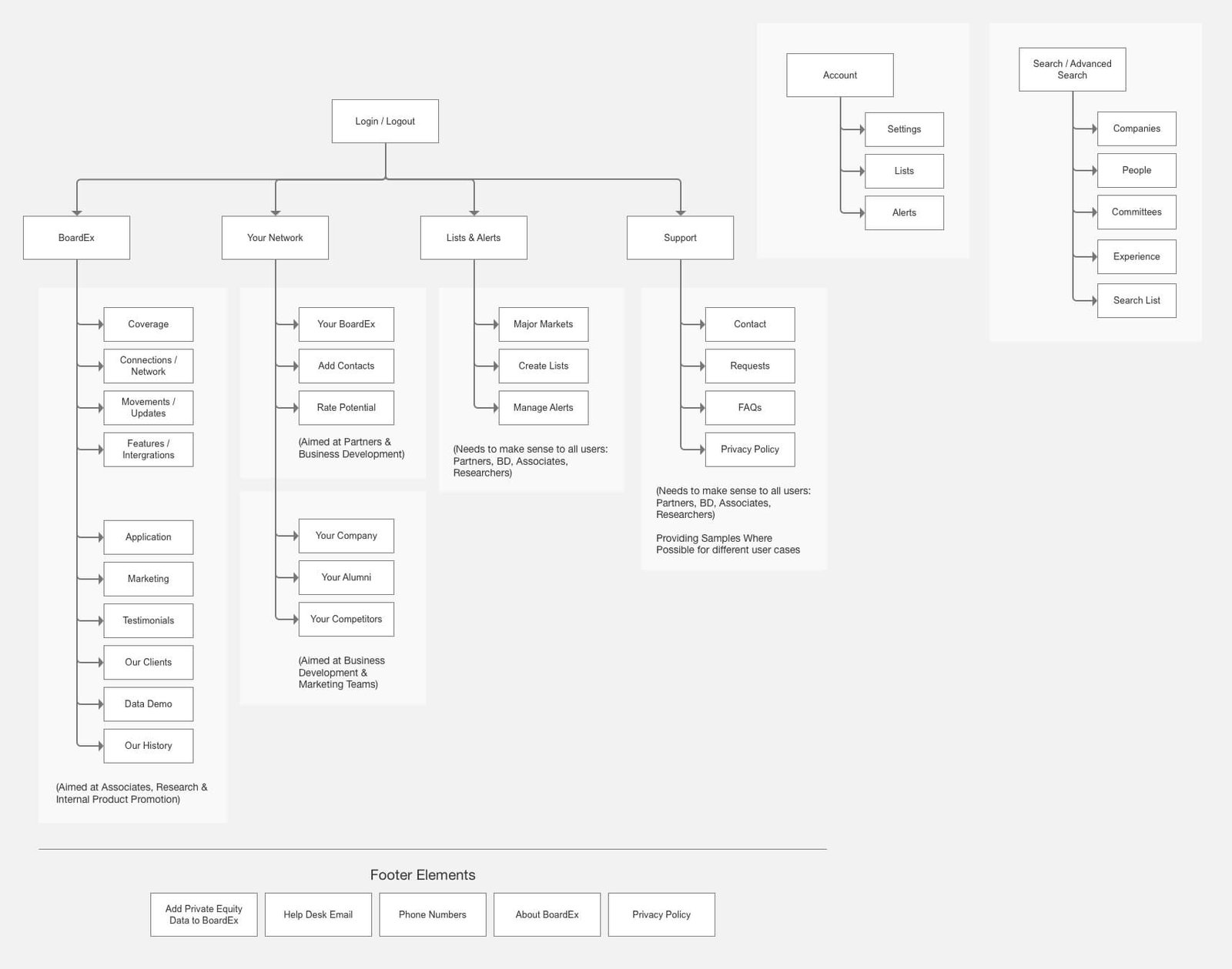
Original information architecture
BoardEx originally had three layers to is navigation structure. A total of 44 options confronted users should they decided to search through the navigation.
It also contains multiple links to the same location, but with different labelling. Unless users were taught the product it was incredibly challenging for new users to understand how BoardEx worked and find their own way around the main menu structure.
Improved information architecture
Taking a holistic view of the product, its information architecture requirements and common online product experiences that most online users are now familiar with, we began to simplify.
Also looking to the research collected, in particular, the common language individuals used to describe their real worlds day-to-day lives, we were able to move towards a more intuitive, natural language information architecture that users could find their way around with assistance.
Original front-end tech
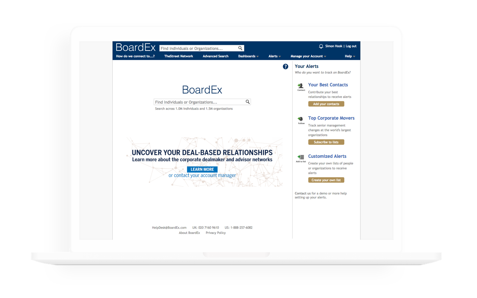
The original front-end technology used to deliver BoardEx's user experience was a very static one.
As users moved around the product they complained of a broken flow from page to page. One which made it tough for people to use the product with no previous experience.
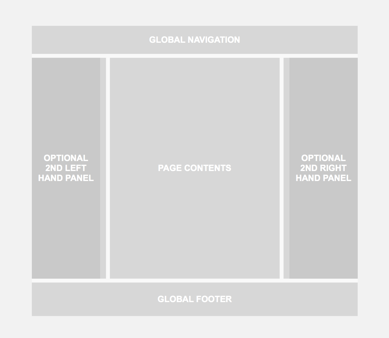
Those users with the luxury of second widescreen monitors felt that there was a lot of wasted screen real-estate un-utilised by the product's implementation.
New framework
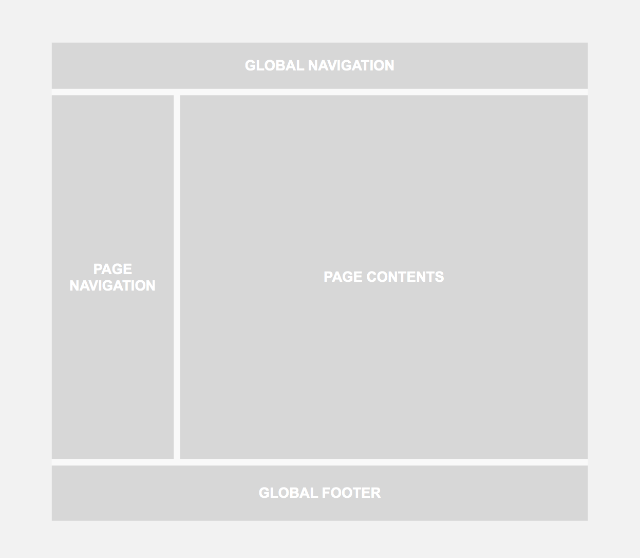
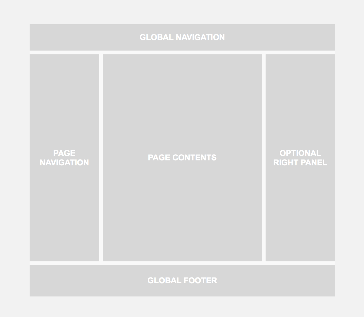
We planned to introduce a responsive framework to the product, empowering an improved user experience across the many different devices which BoardEx users were utilising to access the data. Within the framework, we introduce areas for key features like page navigation, this enabled us to start introducing consistency across the product.
We wanted the ability to separate out key information, use formula online patterns while delivering the possibility of improved speed to market without damaging the option of growth. We also wanted the ability to be able to utilise all of a users screen real-estate should they be working across multiple screens.
Challenging profile
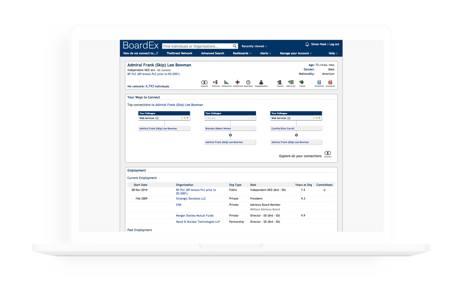
The biggest challenges with BoardEx's profile design was to do with the separation of information, limited use of current online standards and patterns users have grown formula with using.
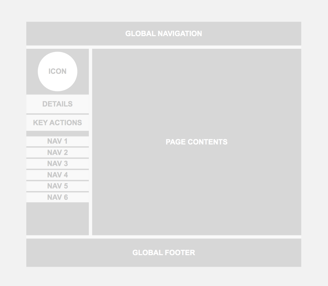
Page navigation items were combined with important action items. Visually there was no clear hierarchy other than from top to bottom, which made it tough for users to quickly scan.
Also, it was impossible for users to manipulate, filter, or sort within the browser delivering a rather static experience for BoardEx's userbase.
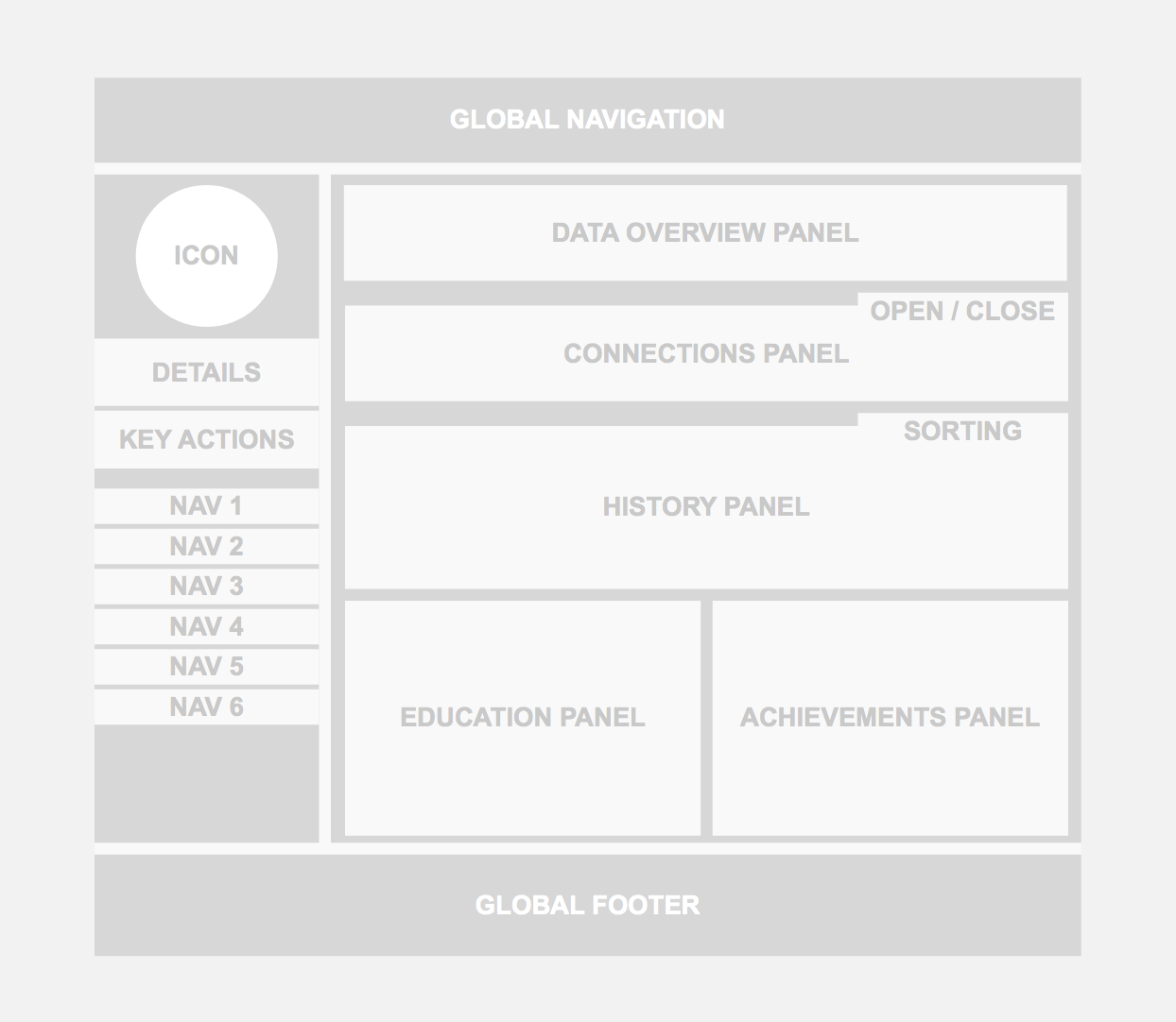
A familiar profile structure
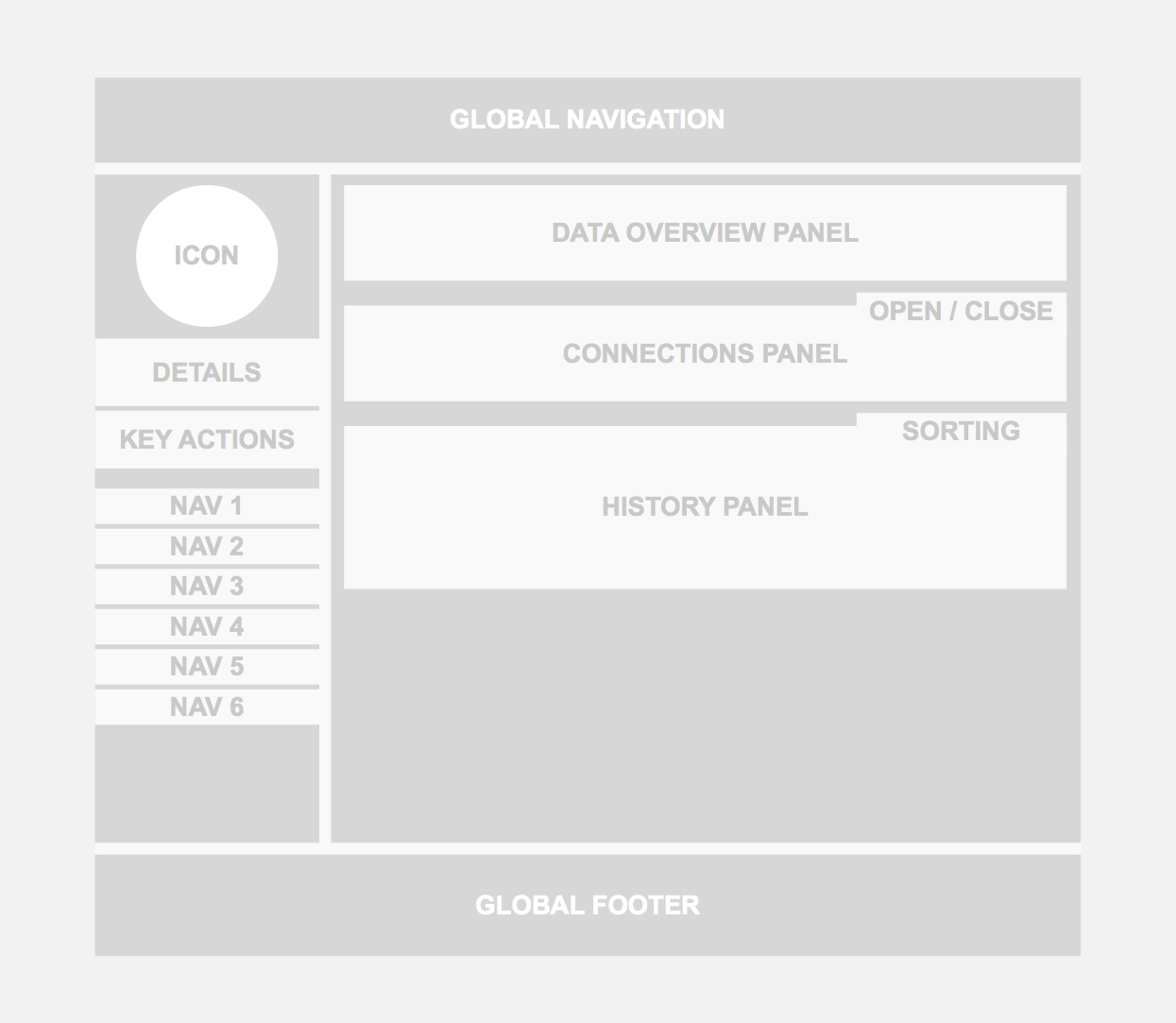
Clarification of important page items was a key strategy for improving BoardEx's profile designs. We wanted to highlight important actions for the business and its users. We wanted to make it easier for users to find their own way around the data.
We started using design patterns from social platforms that users are very formula with, the idea being that not only would this be easier for users to understand how to use but it helped to provide context as to what the product does and how it can help them.
We also added features which enabled users to begin customising the product to their own unique needs. An overview to help junior users get into the data, along with changing terminology to align more with BoardEx's users' natural speech. This aided with the usability while bringing recognised terms to BoardEx that users immediately understood.
Design system
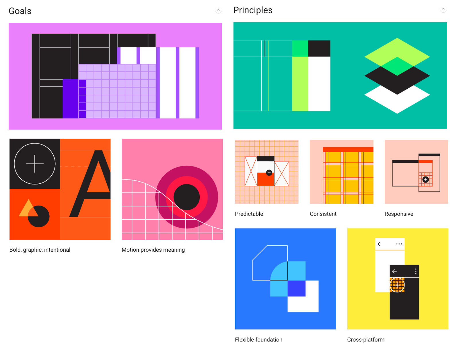
Google pattern library
With a small team and a huge product, it made complete sense to utilise an already developed system. One which would help speed up the entire process of design, development & implementation.
The Google pattern library provided an almost complete, out of the box solution and design system which the product team could use as a solid reference which lay the foundations to our product development.
Having a thorough design system as a reference point empowered me to clearly communicate design and development challenges with senior stakeholders. Although not all our challenges were answered with Google's solution, it provided clear guidance and sight of potential scale for some of the challenges that lay ahead for myself and the team.
Tables & filtering
BoardEx is a product which is focused on data and it's the quality of that data which makes it such a challenging proposition within the market place.
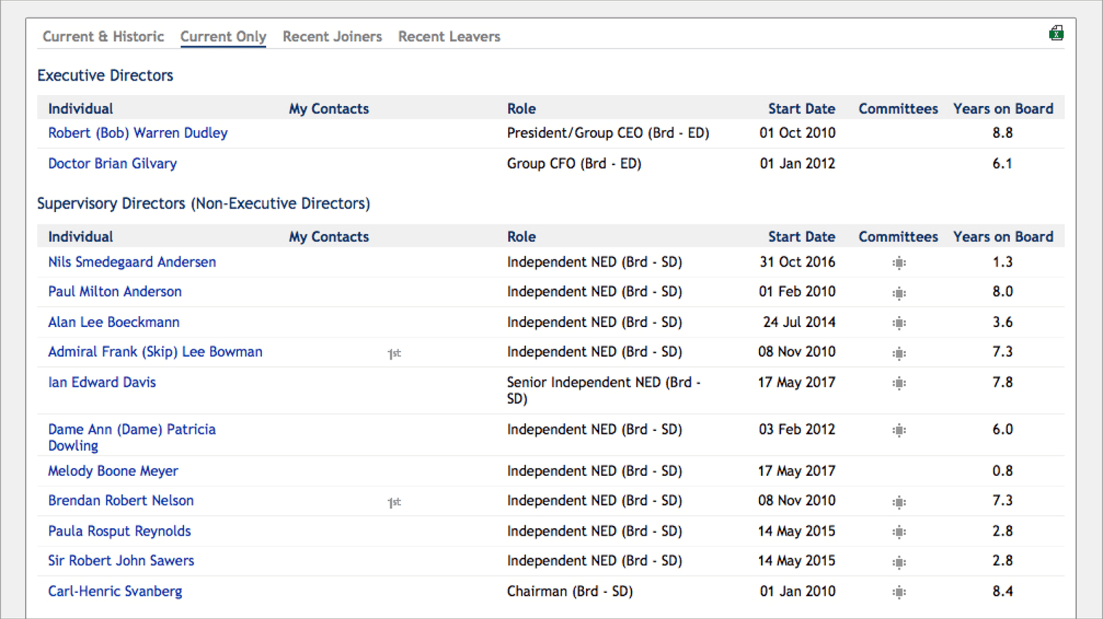
As it stood the data was served a very static manner, one which made it challenging for users to stay within the product. If users required large amounts of data they were forced to download excel files before they could sort, filter and manipulate BoardEx's data.
As part of our improvements, we began to introduce features that would empower users to manipulate the data within the online platform. Streamlining their workflows for more effective use.
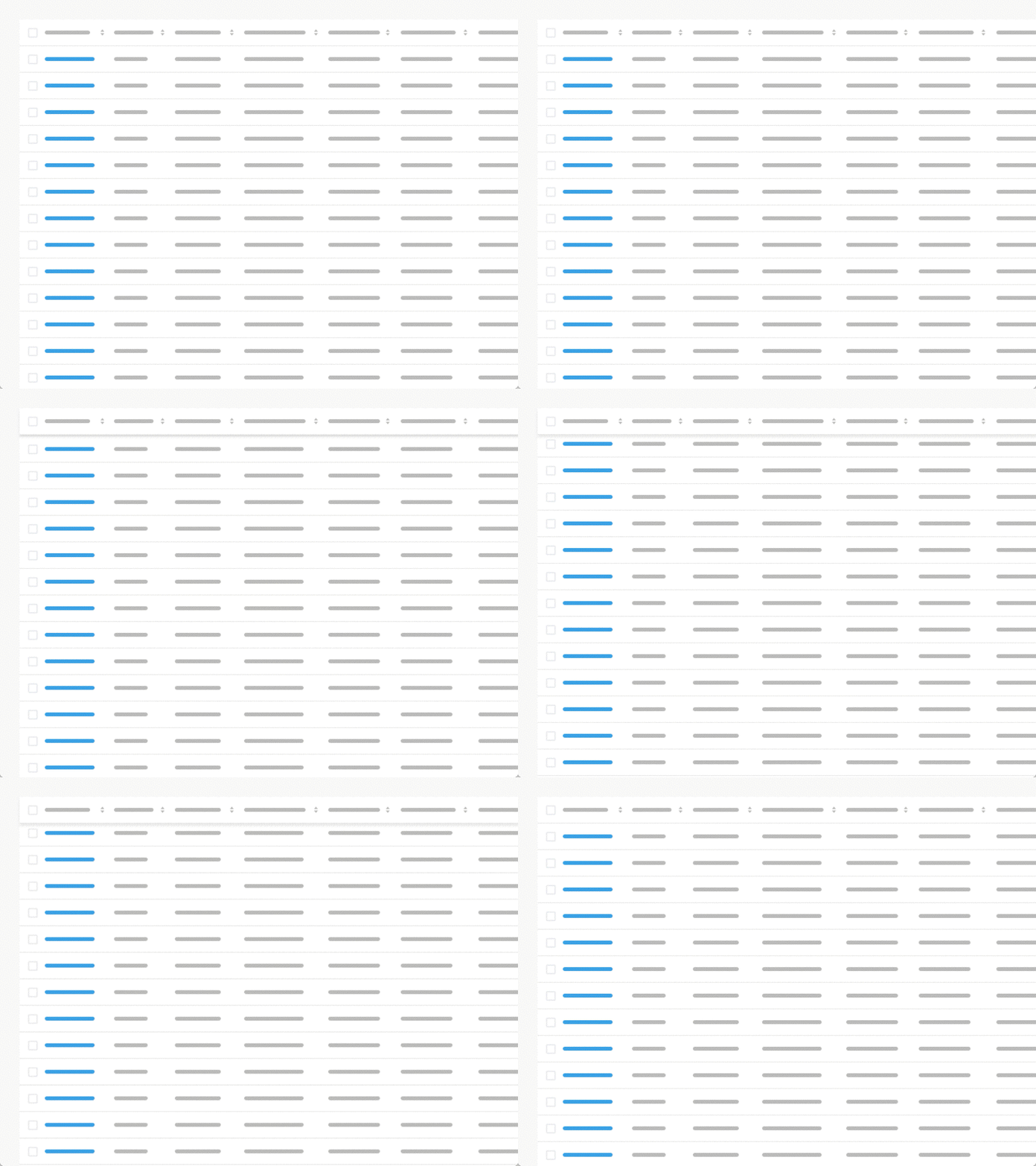
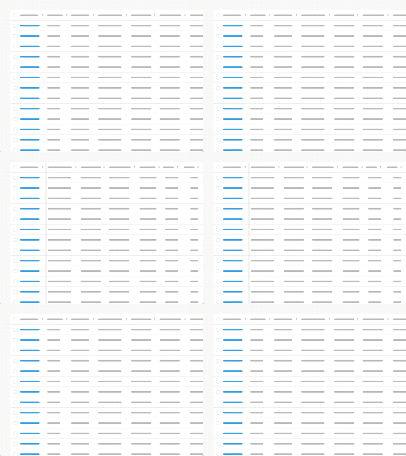
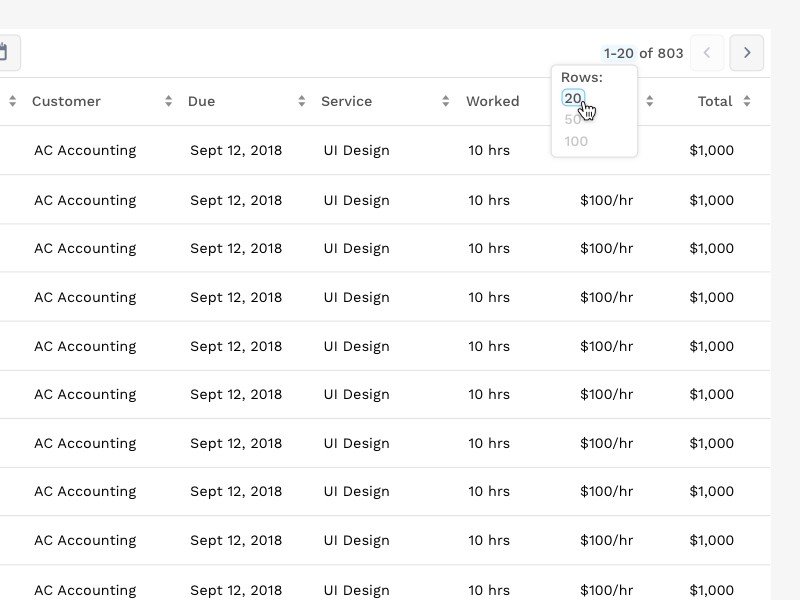
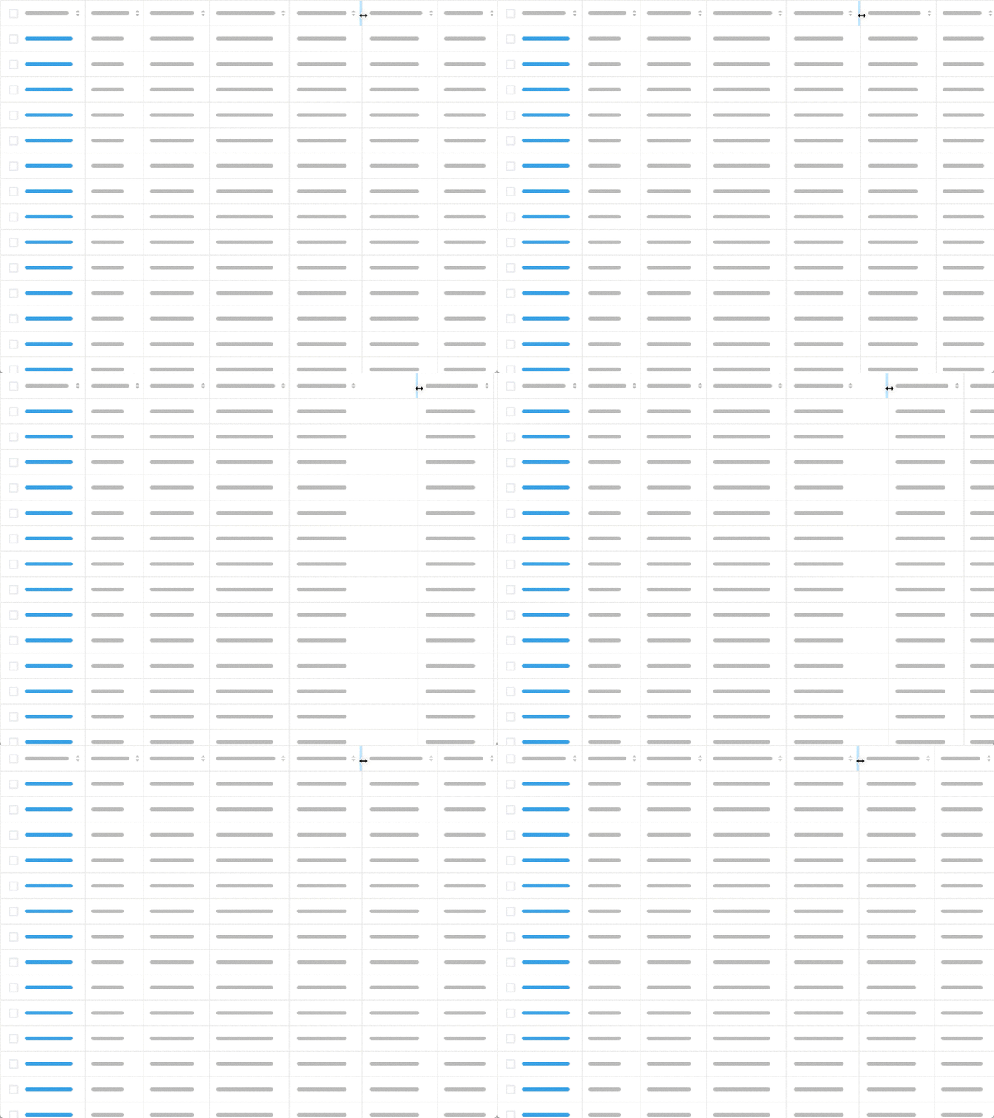
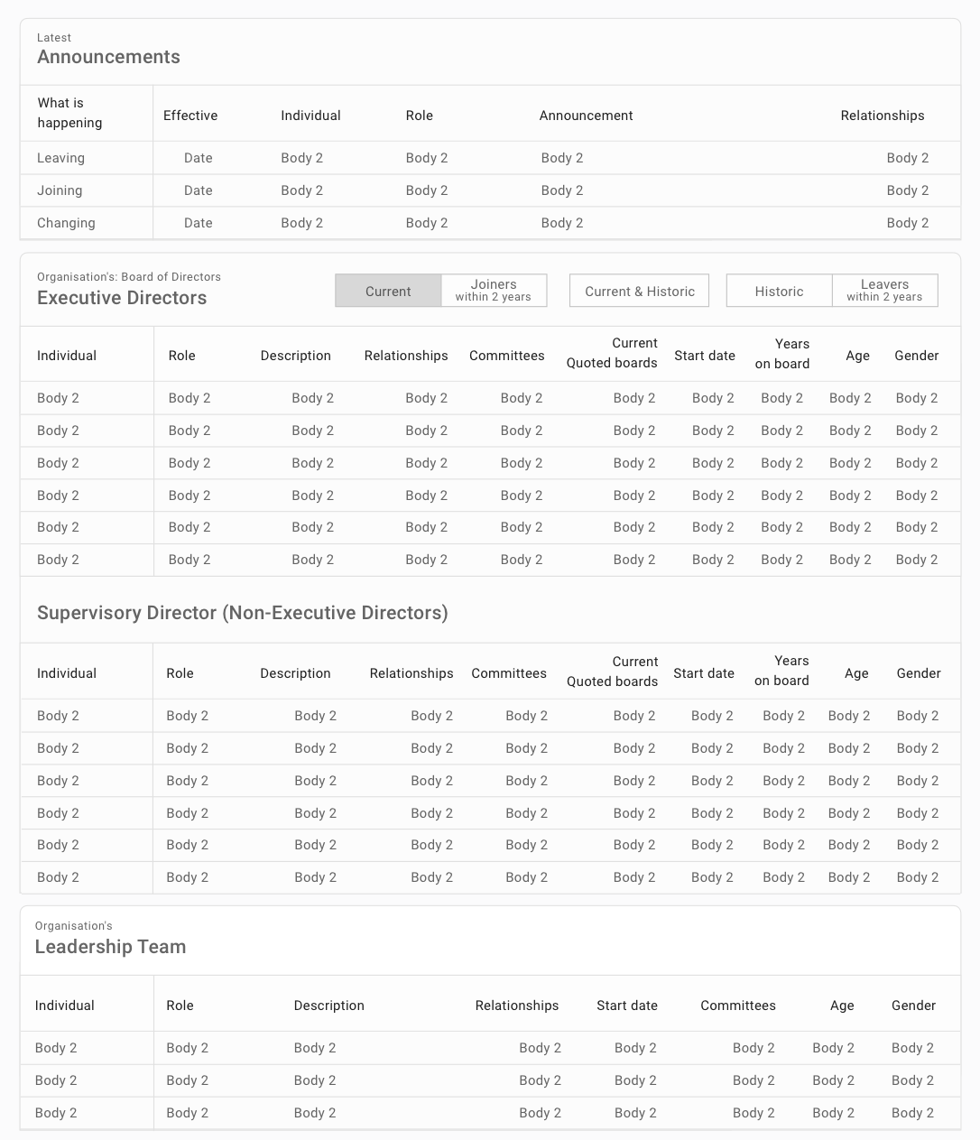
Table styling
As part of the introduction of the new framework, we introduced styling to the table design.
Using cues from Google's Material Design library we looked to utilise typography for the tables as a way to inform users of important datasets.
We styled the tables with clearer headings, different font sizes improving the scannability of the page, while also introducing a move user-centred use of terminology.
User testing allowed us to be confident with the changes before implementation. With the changes, we also moved the design language forward with more obvious button designs, optimised for touch interactions with a confident approach to labels.
Navigation iconography
We originally removed these icons with the idea of a step towards product simplification.
But, post this release, it became apparent that some key clients had fallen in love with the old icons and had been using them within their internal communications with teams for tutorial materials with how to use BoardEx.
Taking cues from the original set we simplified, vectorised and added these key secondary navigation items back into the product.
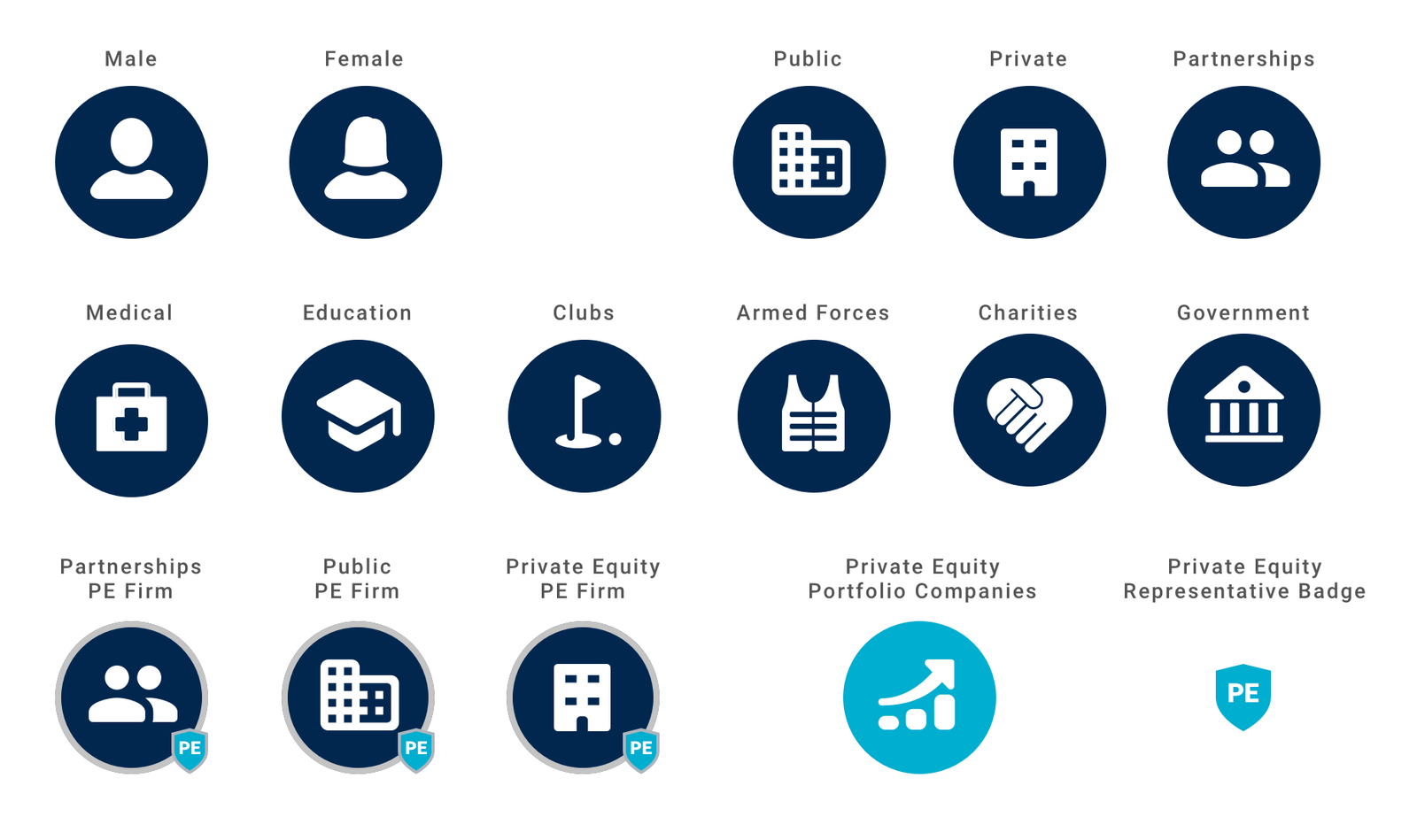
Profile icons
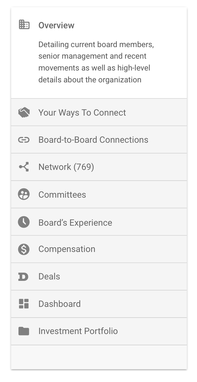
BoardEx contains an incredible amount of data on a wide-ranging portfolio of different companies. The data of an organisation can vary depending on the type of company you are investigating and originally it was challenging for users to see this.
As we improved the structure of the profile pages towards that of an expected pattern for users, we freed up space which enabled us to characterise profiles with simple icons.
We took the opportunity to use a soft, rounded set of icon to help instil an impression of friendliness. We wanted our users to feel welcome and want to return to the product for their data needs.
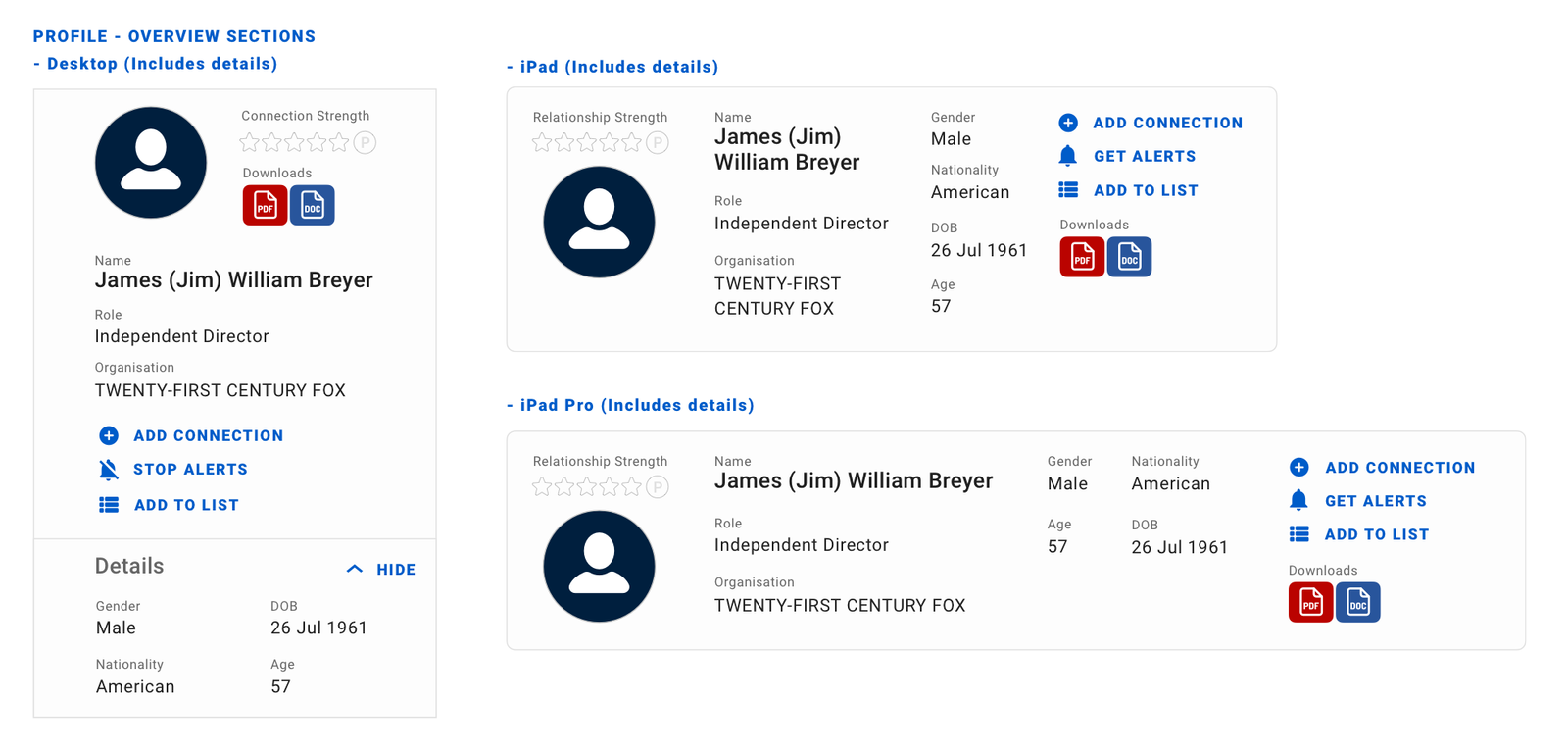
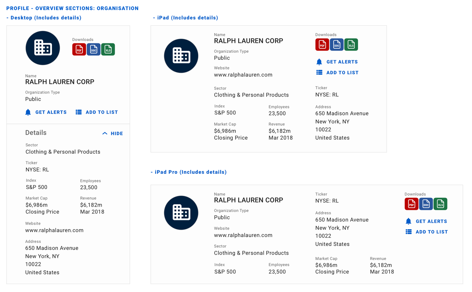
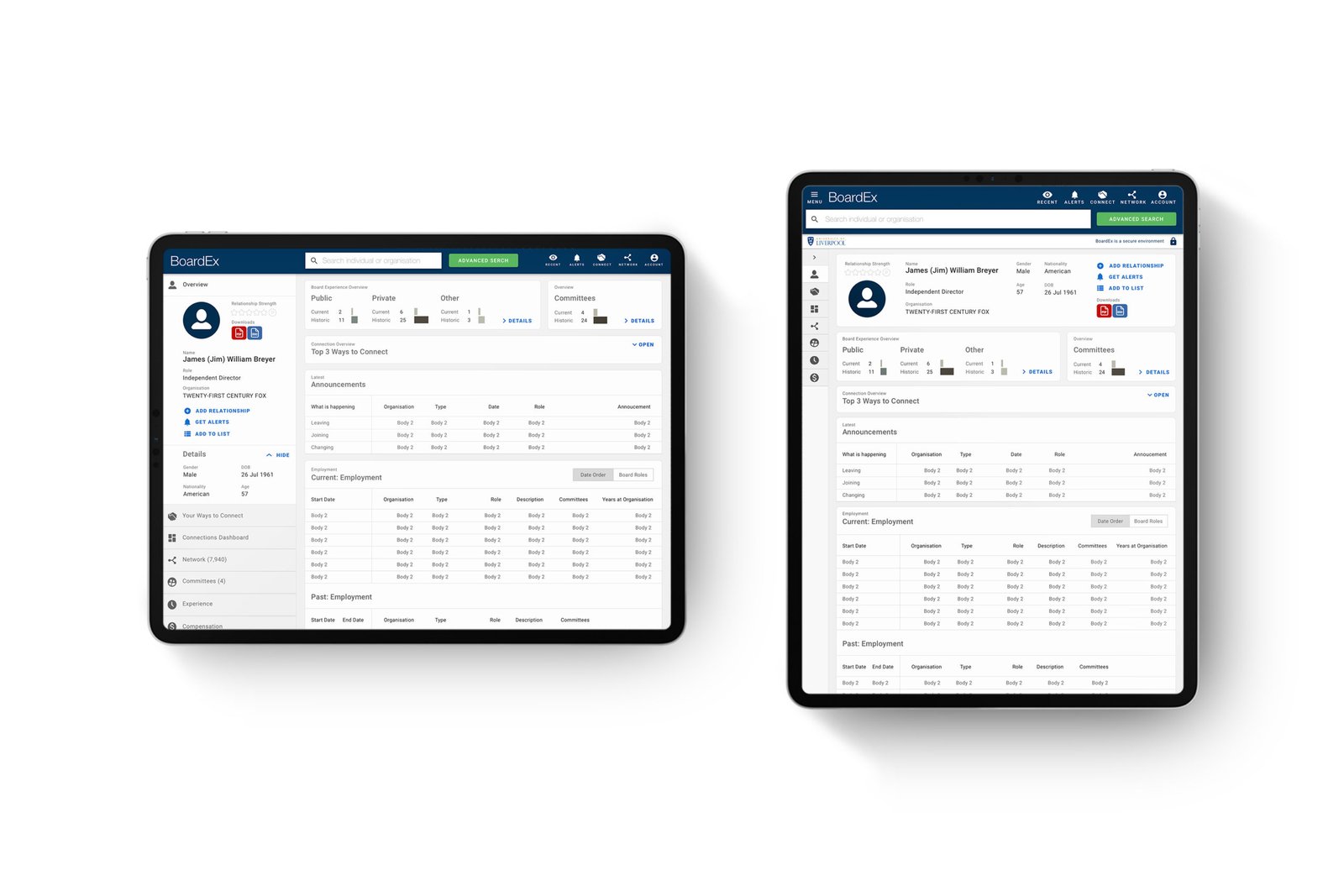
Responsive profile overview panels
Navigation interface design evolution
BoardEx users suffered with a complex navigational structure with a total of 44 options across 3 levels for the user to choose from. In a couple of scenarios, it contained mullite links, with different labelling to the same location.
We worked hard to go through a journey of evolution simplifying the navigational structure, labelling removing client customer terms and introducing simpler more user-centred labels.
Original

Version 2

Version 3

Version 4

Simplified responsive navigation
Once we had come to an agreement on the information architecture of the new navigation, simplifying the complexity, using patterns users were formula with and utilising terms used often during our research sessions we moved onto the interface design.
Tablets / iPad pro

Laptops / Macbook pro

Larger Monitors / iMac

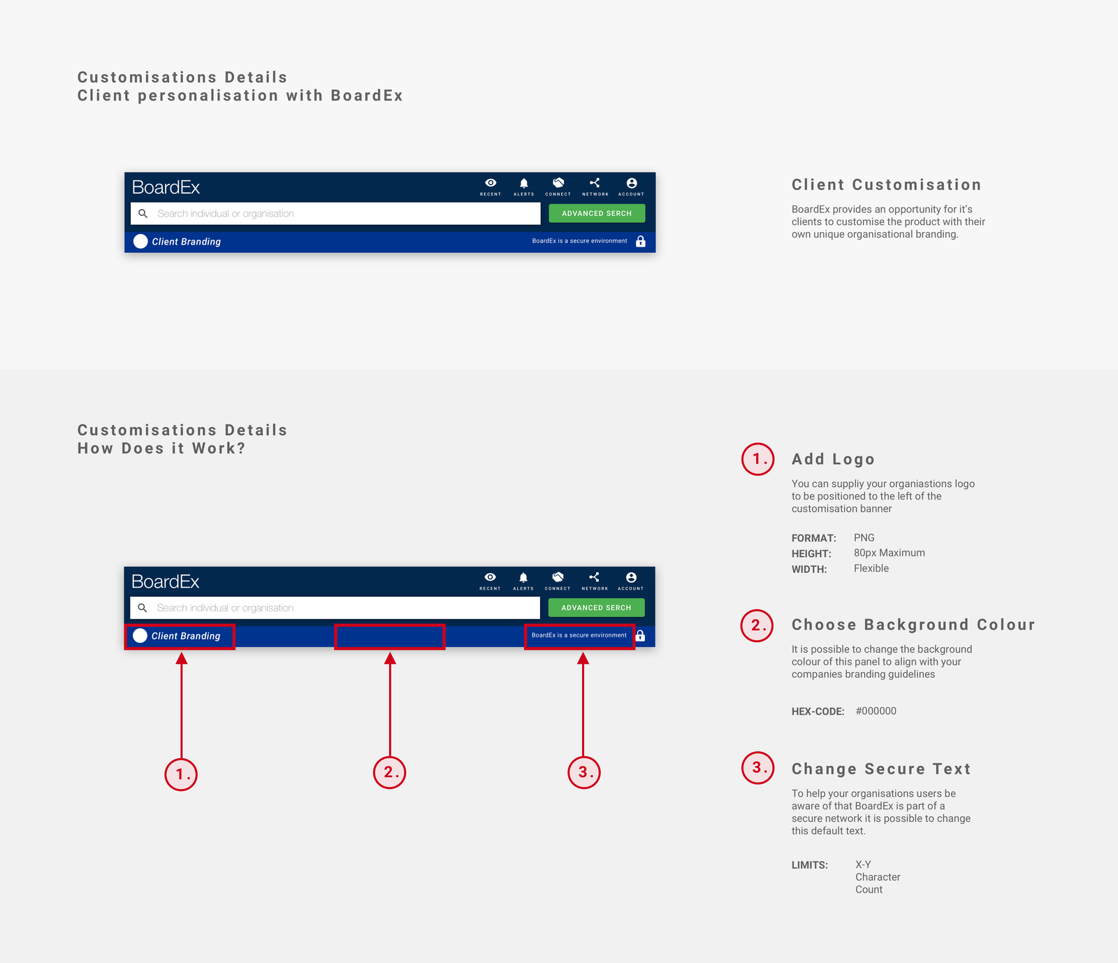
Client branding & reassurance
With the introduction of updated navigation, we also introduced an area for client customisation.
Feedback sessions with users often raised concerns over the security of BoardEx. People avoided added contacts as they weren't confident that the information wouldn't be shared outside of their organisations with other BoardEx clients.
This feature aimed to bring reassurance to users that BoardEx was secure and a trusted piece of software for own organisations.
BoardEx responsive profile design
Data visualisation
User feedback
Feedback from users consistently referenced the challenges of understanding the data and it's potential power for their organisation.
Business development teams, in particular, described their specific frustrations when communicating with senior partners. They told us that it would often take a 20-30 minute conversation for colleagues to understand the insights BoardEx was delivering.
Once understood it gave senior partners the knowledge and power to leverage the connections they often weren't aware they had.
How to visualise the board of directors of a company
Data points of an organisation, it's connections to a market and the relationships owned by senior individuals within a company were originally displayed within a table format. This was great for researchers who understood the data and how to use the product, but this understood in the same way for everyone, in particular, the relationship owners within an organisation.
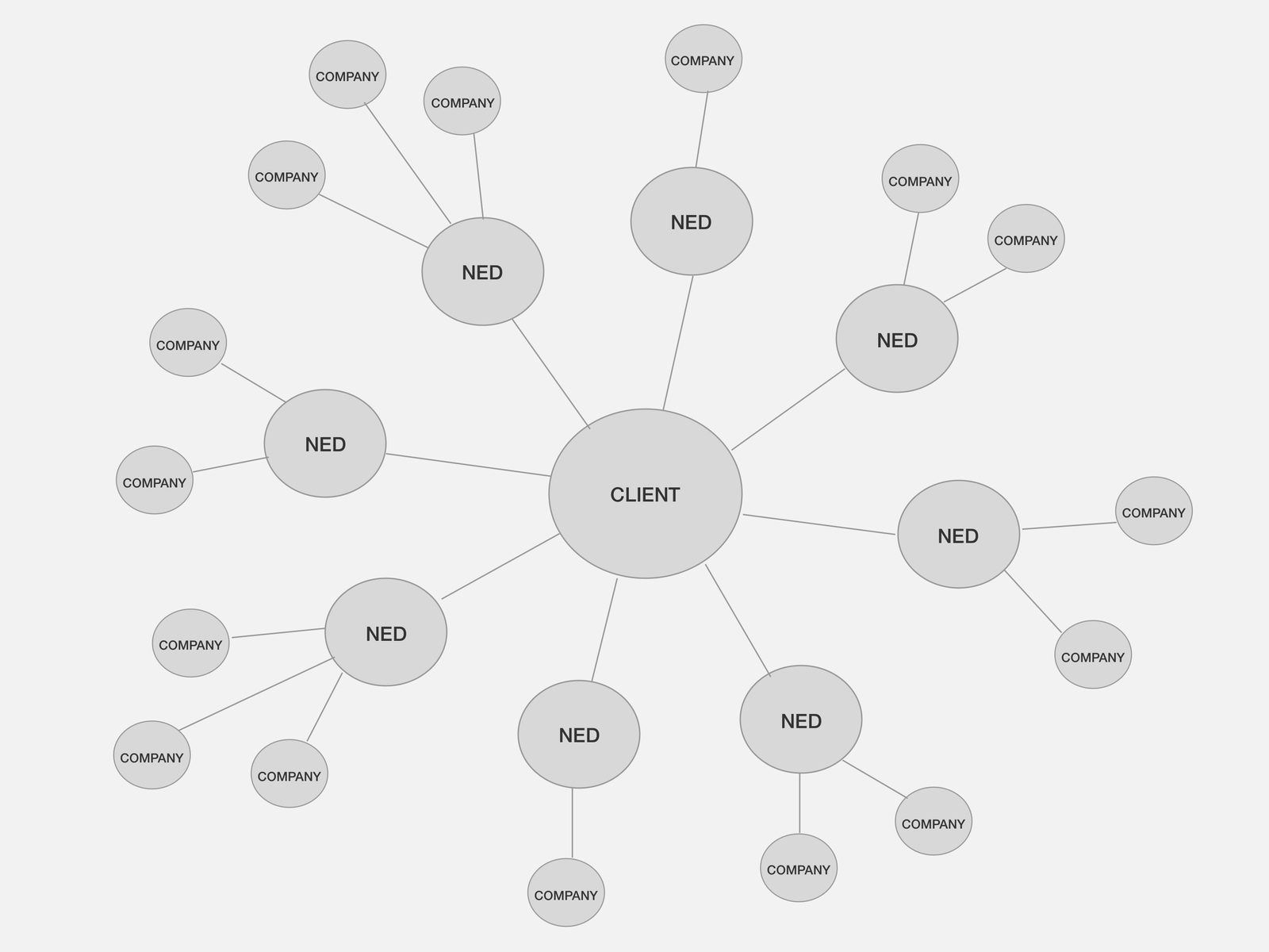
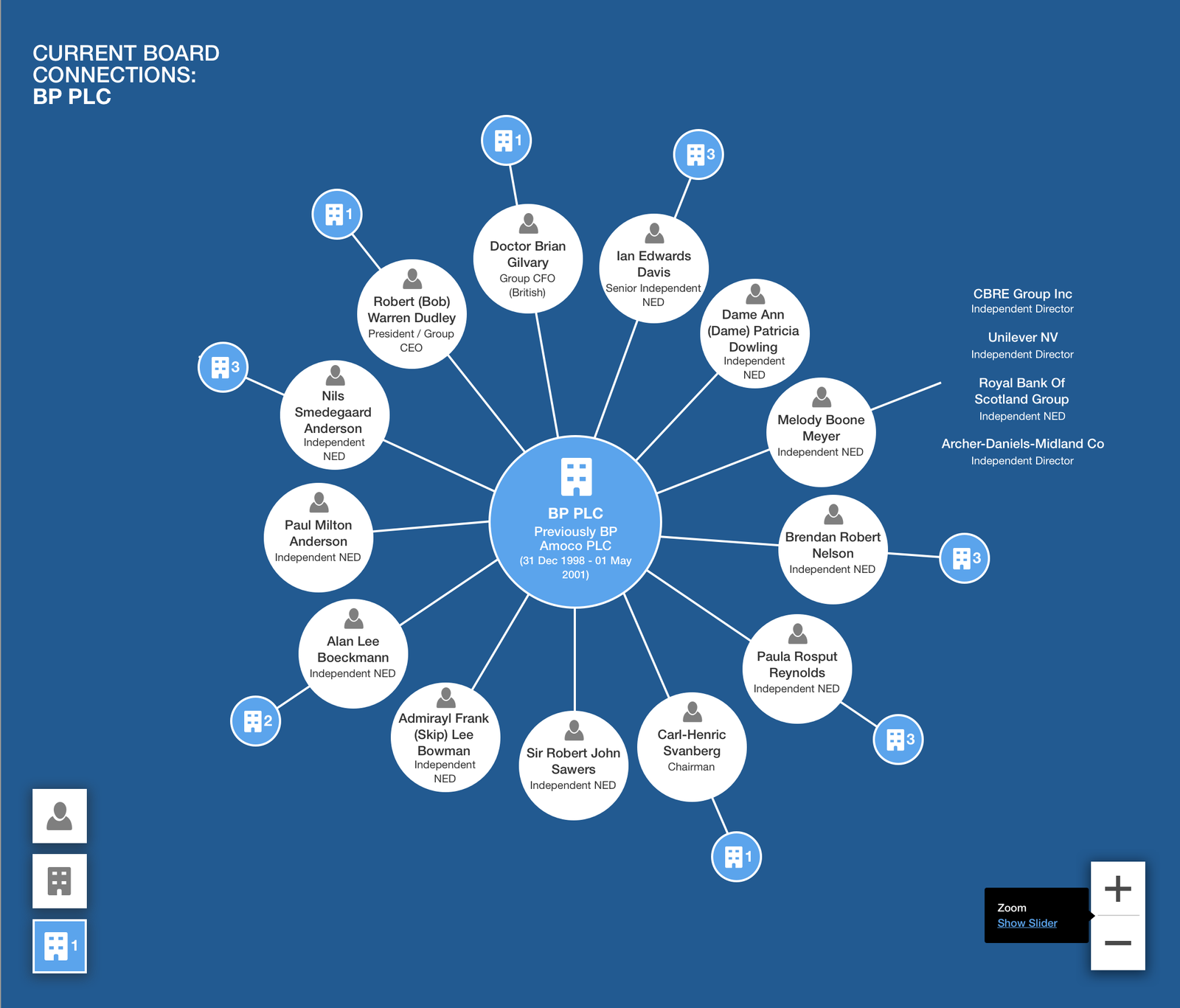
I wondered how interpretations of the data would improve if we were to separate out the data to provide a more visual view of the connections that a company's board has to the wider market place.
Concepting, usability testing & iterations
Through a process user testing, we were able to iterate the initial concept and idea into implementation within the product.
The concept enabled us to have conversations around the idea with clients. This empowered us to create wireframes to run further tests with.
These wireframes where than prototyped, which again enabled us to test with users. While the development team investigated different front-end technologies to develop an implementation.
Speeding up Internal Conversation
Once launched, all clients were absolutely thrilled with this new feature. Some said that it took a 30-minute conversation to explain the data down to just 2-minutes as people could see the details for themselves.
Visually laying out the data meant BoardEx clearly communicated with those unfamiliar with the platform, its potential content. Enabling other individuals sitting outside of research within the corporate structure to still utilise this valuable data set for their organisations.
Right: User interface design concept for implementation
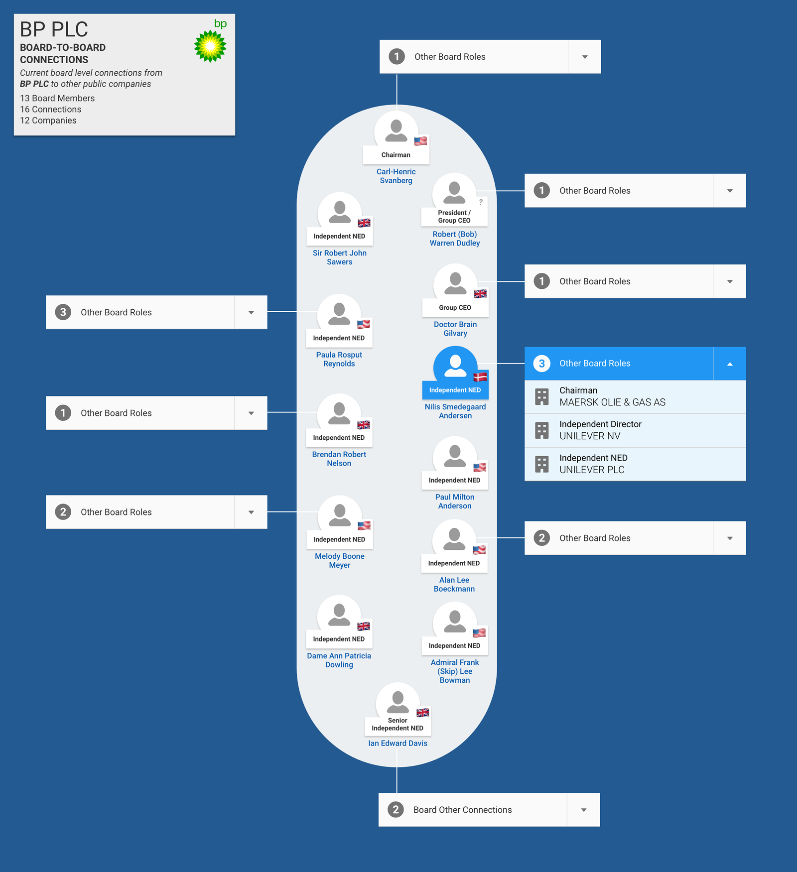
The Board of Directors visualised
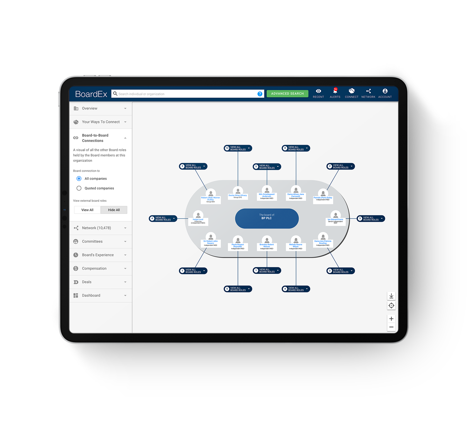
Results
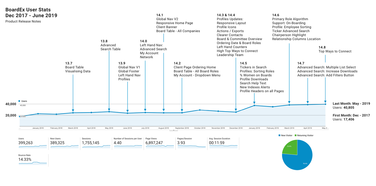
17,406 – 40,805 Monthly users
With company-wide support form the product team, its board of directors, the c-suite of senior management, the passionate client services, knowledgeable data teams and BoardEx's users. The team was able to more than double its active userbase over 18 months.
Reimagining the information architecture, implementing a responsive framework, introducing a design system, visualising the data, creating an onboarding sequence and bringing more capabilities for data manipulation into the product all helped to improve the BoardEx user experience.
The biggest win for the team was that in line with other initiatives happening across the business BoardEx was sold to EuroMoney part of an $84million acquisition deal.
